Let’s look at the surface temperatures in the summer of 2010, which justifiably received a lot of attention. Figure 1 shows maps of the June-July-August temperature anomaly (relative to 1951-1980) in the NASA Goddard Institute for Space Studies (GISS) temperature analysis (described in paper in press at Reviews of Geophysics, available online [PDF]) for 2009 and 2010, as well as maps for December-January-February (Northern Hemisphere winter, Southern Hemisphere summer) for the past two years.
June-July-August 2010 was the fourth warmest in the 131 year GISS analysis, while 2009 was the second warmest. 2010 was a bit cooler than 2009 mainly because a moderate El Nino in the equatorial Pacific Ocean during late 2009 and early 2010 has been replaced by a moderate La Nina. Also most of Antarctica was cool in winter 2010, while it was warm in 2009. Antarctic winter temperature anomalies are very noisy, fluctuating chaotically from year to year.
The maps make clear that perceptions of how hot it was depend on where you live. The two warmest anomalies on the planet this past summer were Eastern Europe and the Antarctic Peninsula. Not many people live on the Antarctic Peninsula and an anomaly of even several degrees in winter there is not a big deal. But the warm anomaly centered in Eastern Europe, which covered most of Europe and the Middle East, was noticed, to say the least. It was also quite warm in Japan, where the prior summer had been cooler than the 1951-1980 mean. The United States, which had been unusually cool in the summer of 2009, was warm this past summer, except the Pacific Northwest, which was cooler than the 1951-1980 climatology.
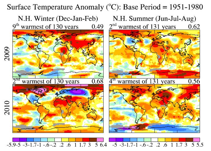 Figure 1. Seasonal-mean temperature anomalies relative to 1951-1980 mean for the most recent two summers and winters.
These global temperature anomaly maps may help people understand that the temperature anomaly in one place in one season has limited relevance to global trends. Unfortunately, it is common for the public to take the most recent local seasonal temperature anomaly as indicative of long-term climate trends. Last winter in the Northern Hemisphere (left side of Figure 1) provided a good example of this misperception. As discussed in the Reviews of Geophysics paper, the extreme winter cold anomalies in Eurasia and the United States were a fluke associated with the most extreme Arctic Oscillation in the record.
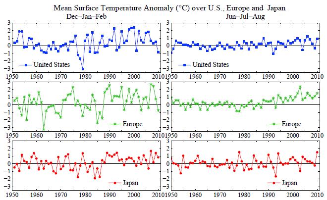 Figure 2. Winter and summer temperature anomalies over United States, Europe, and Japan relative to 1951-1980 mean. Areas employed to calculate anomalies were the 48 contiguous states for the United States, rectangle defined by 36-70N latitude and 10W-30E longitude for Europe, and 40 1-by-1 degree boxes approximately covering Japan. If the box defining Europe were extended to the east to encompass western Russia, the 2010 anomaly would be comparable to the warm anomaly in 2003.
This does not mean that local anomalies are unrelated to global trends, but it is necessary to look at statistics. Figure 2 shows winter and summer surface temperature anomalies averaged over the United States (contiguous 48 states), Europe, and Japan. In each of these locations, either seven or eight of the last 10 winters were warmer than the 1951-1980 mean winter temperature. Summer temperatures are a bit less noisy: Eight of the last 10 summers were warmer than the 1951-1980 mean in the United States and Japan, and 10 of 10 in Europe. So if you are perceptive and old enough, you should be able to notice a trend toward warmer seasons.
Extreme anomalies get the most attention, and rightly so because they have the greatest practical impact. Figure 2 is relevant to the likelihood of having extreme climate anomalies. For example, the curve for European summer temperatures shows how the baseline is shifting. The hot summer of 2003 was so far above the long-term mean summer temperature that it may have seemed to be a once in 1000 years fluke. However, Figure 2 shows that the baseline for summer temperature in Europe has changed as global warming occurred over the past few decades. That trend is expected to continue if greenhouse gases continue to increase, so it will not be surprising if an extremely warm summer anomaly occurs there again within the next several years.
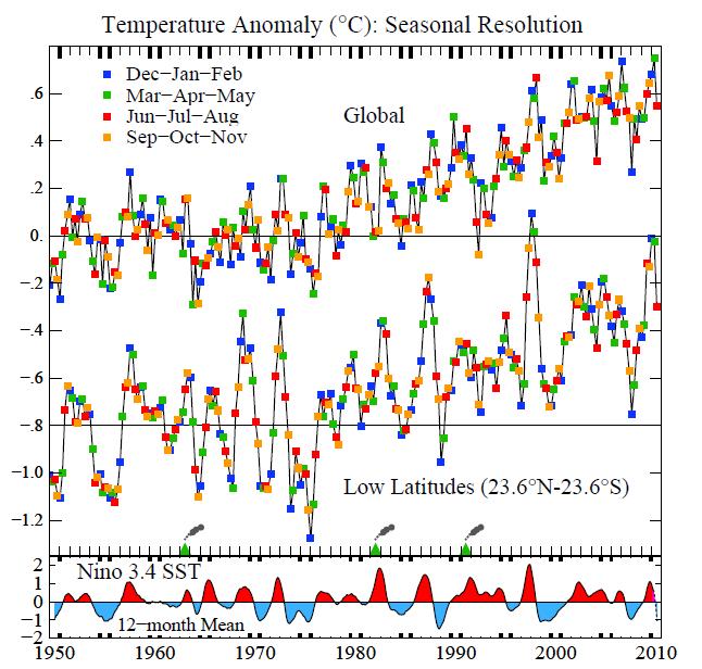 Figure 3. Seasonal temperature anomalies relative to 1951-1980 mean for the globe and for low latitudes. Nino 3.4 index is as defined in Reviews of Geophysics preprint.
Figure 3 has graphs of the global and low latitude seasonal temperature anomalies. The low latitude anomalies are strongly dependent on the El Nino-La Nina cycle of equatorial Pacific Ocean temperature anomalies, as shown by the Nino 3.4 SST2. Global temperature anomalies tend to reflect Nino variability, with, on average, a lag of about three months.
The global seasonal temperature anomaly for March-April-May in 2010 was the warmest in the 131 year GISS temperature data set. The low latitude temperature anomaly was less than in 1998, as the recent El Nino was much weaker than the one in 1998. The June-July-August temperature anomalies dropped as the equatorial Pacific Ocean has moved into the La Nina phase. Computer models suggest that the La Nina may peak near the end of 2010. Regardless of how long the current La Nina extends, the next two or three seasonal-mean global and low latitude temperature anomalies are likely to be cooler than the anomalies for the past four seasons.
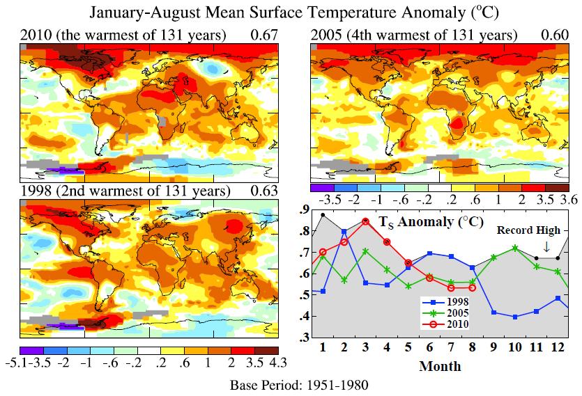 Figure 4. January-August surface temperature anomalies during three specific years in the GISS analysis, and comparison of global monthly anomalies for those years.
Figure 4 provides an indication of the likely effect of the current cooling trend on the rank of the 2010 calendar year temperature anomaly. The maps compare January-August temperature anomalies for 2010, 2005 (the warmest year in the GISS analysis), and 1998 (one of the warmest years in the GISS analysis, the temperature being boosted by the “El Nino of the century”). 2010 is clearly the warmest of these years for the first eight months. However, the 4th section of Figure 4 shows that the monthly anomalies in 2010 have declined steadily over the past five months as the Pacific Ocean moved into the La Nina phase. The last four months of 2005 (green line in Figure 4) were unusually warm, so it is not possible to say yet whether 2005 or 2010 will be the warmest calendar year in the GISS analysis. It is likely that the 2005 and 2010 calendar year means will turn out to be sufficiently close that it will be difficult to say which year was warmer, and results of our analysis may differ from those of other groups. What is clear, though, is that the warmest 12-month period in the GISS analysis was reached in mid-2010, as shown in the Reviews of Geophysics preprint.
Projections of trends over the next few years are possible based on the following considerations: (1) the planet is out of energy balance by at least several tenths of one W/m2 due to the rapid increase of greenhouse gases during the past f
ew decades, as confirmed by measurements of changing ocean heat content, (2) inertia of energy systems that assures continuing growth of atmospheric CO2 by about 2 ppm per year for the next few years, (3) expectation that the solar irradiance will climb out of the recent long-lasting solar minimum, as shown in Figure 5, (4) model projections suggesting that the current La Nina may bottom out near the end of 2010. Given the dominant effect of El Nino-La Nina on short-term temperature change and the usual lag of a few months between the Nino index and its effect on global temperature, it is unlikely that 2011 will reach a new global record temperature.
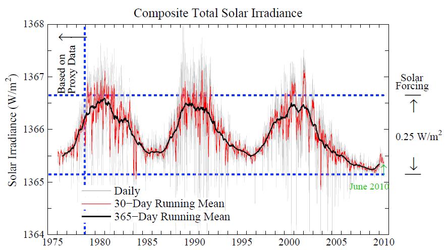 Figure 5. Solar irradiance through June 2010. [Fröhlich & Lean, Astron. Astrophys. Rev. 12, 273, 2004.]
In contrast, it is likely that 2012 will reach a record high global temperature. The principal caveat is that the duration of the current La Nina could stretch an extra year, as some prior La Ninas have (see Nino 3.4 index at the bottom of Figure 3). Given the association of extreme weather and climate events with rising global temperature, the expectation of new record high temperatures in 2012 also suggests that the frequency and magnitude of extreme events could reach a high level in 2012. Extreme events include not only high temperatures, but also indirect effects of a warming atmosphere including the impact of higher temperature on extreme rainfall and droughts. The greater water vapor content of a warmer atmosphere allows larger rainfall anomalies and provides the fuel for stronger storms driven by latent heat.
Finally, a comment on frequently asked questions of the sort: Was global warming the cause of the 2010 heat wave in Moscow, the 2003 heat wave in Europe, the all-time record high temperatures reached in many Asian nations in 2010, the incredible Pakistan flood in 2010? The standard scientist answer is, “You cannot blame a specific weather/climate event on global warming.” That answer, to the public, translates as “No.”
However, if the question were posed as, “Would these events have occurred if atmospheric carbon dioxide had remained at its pre-industrial level of 280 ppm?,” an appropriate answer in that case is “Almost certainly not.” That answer, to the public, translates as “Yes,” i.e., humans probably bear a responsibility for the extreme event.
In either case, the scientist usually goes on to say something about probabilities and how those are changing because of global warming. But the extended discussion, to much of the public, is chatter. The initial answer is all important.
Although either answer can be defended as “correct,” we suggest that leading with the standard caveat, “You cannot blame … ” is misleading and allows a misinterpretation about the danger of increasing extreme events. Extreme events, by definition, are on the tail of the probability distribution. Events in the tail of the distribution are the ones that change most in frequency of occurrence as the distribution shifts due to global warming.
For example, the “hundred-year flood” was once something that you had better be aware of, but it was not very likely soon and you could get reasonably priced insurance. But the probability distribution function does not need to shift very far for the 100-year event to be occurring several times a century, along with a good chance of at least one 500-year event.