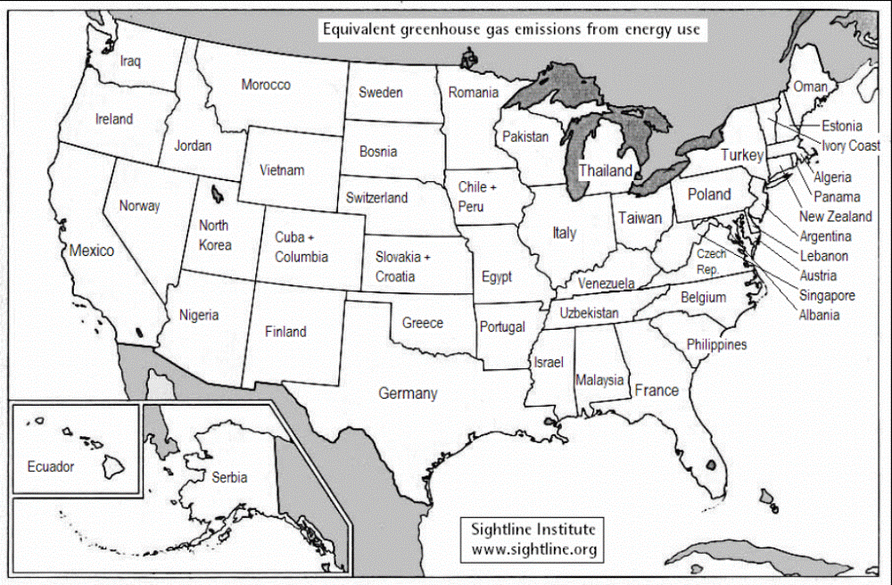
Ever wondered if your state’s climate policy really makes a difference in the big global scheme of things? If so, here’s a little map I made.
For each state, the map shows a nation with equivalent greenhouse-gas emissions from energy.
The full U.S. version is here.
When I’ve shown drafts to people, almost everyone wants to compare populations. The western states population comparison is after the jump. The full data are here(xls).
Number of people (in millions), 2003

I find the full U.S. map a bit overwhelming. Even more so when I realize that the 2003 population of the U.S. — less than 300 million — has the same climate impact as the more than 1.5 billion people represented by the other countries listed on the map.
And now, a word about my methodology. All data are from the U.S. Department of Energy. Ghg data are an average of the period from 2001 to 2003; population data are for 2003. Emissions are from energy use only and they do not include carbon sinks. Countries are considered “equivalent” if their total emissions are within 10 percent of a state’s emissions. Obviously, there a million ways to slice these comparisons since many states and countries have similar levels of emissions.
