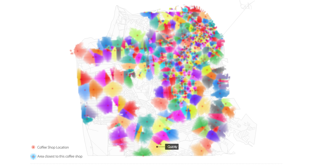

San Francisco coffee shops. Click to embiggen.
Walking down the street, that feeling swells up inside you — the buildings, the restaurants, the parks, the people: THIS is New York.
Or maybe it’s San Francisco. Or Chicago. Or LA. Whatever your city of choice may be, you love it because it’s just got that je ne sais quoi, unlike any other.
But Sep Kamvar, of the Social Computing Group at the MIT Media Lab, thinks it could be so much more interesting than that. With his You Are Here project, he and his group are on a quest to bring out all those little pieces that come together to make each city what it is, by creating a total of 10,000 data visualization maps of cities across the U.S. By doing so, he hopes that urbanites might recognize the elements that they love, and the ones they don’t, to shape their towns into more efficient, happier, healthier, and greener places.
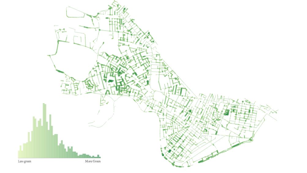
You Are HereA map showing greenery on the streets of Cambridge, Mass. Click to embiggen.
“Each map gives a different angle of what the city looks like,” Kamvar says. The group does this by collecting data from sources ranging from Google Maps to local police departments, and presenting it into compelling visuals — which he hopes can expose the things that need to be fixed.
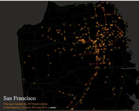
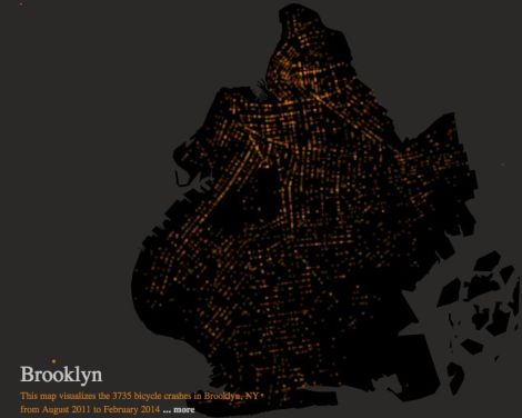
What do you get out of seeing that bicycle crashes in Brooklyn concentrate around Williamsburg and in San Francisco near The Mission, as shown in the maps above? Besides confirming our suspicions that hipsters can be clumsy with their wheels, Kamvar says the data can help city cyclists advocate for safer streets. And they can further build their case with the Best Mode of Transportation series, which shows that, in many cities, cycling beat out walking, driving, and public transit as the fastest way to get around. “Part of the challenge with urban design is that so much [of what makes a city] is invisible,” Kamvar says. “I kind of think of cities themselves as societal organisms. … Bringing attention to certain things allows a society to subtly shape them.”
The maps are pretty to look at, too. That’s because Kamvar approaches them with backgrounds in both computer science and art. He’s got a Ph.D in scientific computing from Stanford University, and his artwork has been exhibited across the world, including New York’s Museum of Modern Art and the Victoria and Albert Museum in London. The idea to merge art, data, and software started from observing the food truck scene in San Francisco. Where did the sudden explosion of delicious mobile meals begin? More practically, how did they all get around SF’s strict food truck licensing? When he looked into it, as far as he could tell, the answer was Twitter. “They could drive to a different location every day and tweet where they were,” he says. “Which ended up shaping the city … and not in the traditional way software shapes things, but by enabling a social process that in turned shaped the city. And so that led me to a number of ideas of using software to shape real space.”
If we’re looking for a road forward to shape the cities we love — to have more of what we love about them — Kamvar’s maps just might be able to show us the way.