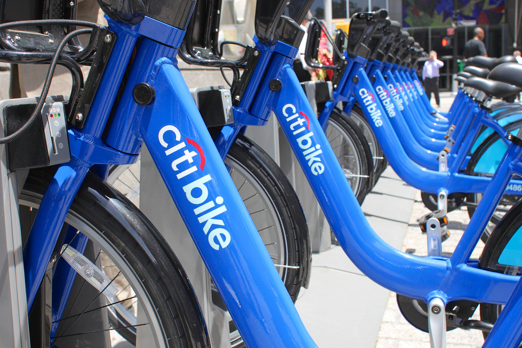
If you live in NYC, you’ve probably seen your fair share of Citi Bikes whiz past. But do you ever wonder where all those riders are actually going? Now that Citi Bike has released a heap of data on who’s been using its system, data visualization buffs have come up with all sorts of ways to answer that question — like a map that correlates weekend data with where to find NYC’s best nightlife, or this project, which sketches out 5.5 million bikeshare trips over eight months, showing the most popular routes.
But if you really want to trance out, watch this video from Jeff Ferzoco, which traces rides through time as the city morphs from lonely ambling 2 a.m. partiers to the full-fledged ant hive of 8 a.m. commuters to clusterfucks caused by traffic delays — till everyone goes back home, and does it all again.
[vimeo http://vimeo.com/89305412]