Seattle mapmaker and urban planner Jeffrey Linn loves cities. “I spend a lot of time thinking about cities and how people fit into them,” he writes on his website. “I walk. I bus. I sometimes bike. I like trains and cables and pantographs. I think the row house is the pinnacle of residential urban form.”
Recently, while in between jobs, Linn started creating maps of major U.S. cities — underwater. Because that’s always fun.
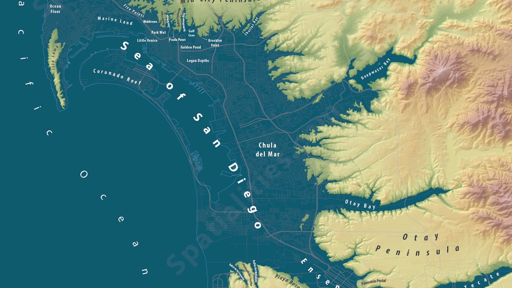
Specifically, his maps show what coastal cities would (will) look like if (when) all the ice caps melt, and the seas rise roughly 80 meters, or 260 feet. (That estimate comes from the U.S. Geological Survey.) Taking a cue from blogger Burrito Justice, who created a map of San Francisco under 200 feet of water, Linn adds imaginative new names to the future islands, archipelagos, and underwater features in his soggy topographies.
Here’s Linn’s (and Grist’s) hometown. (Great news for my greatx50 grandkids! If all goes well, you’re gonna inherit a beach house on Meridian Island!)
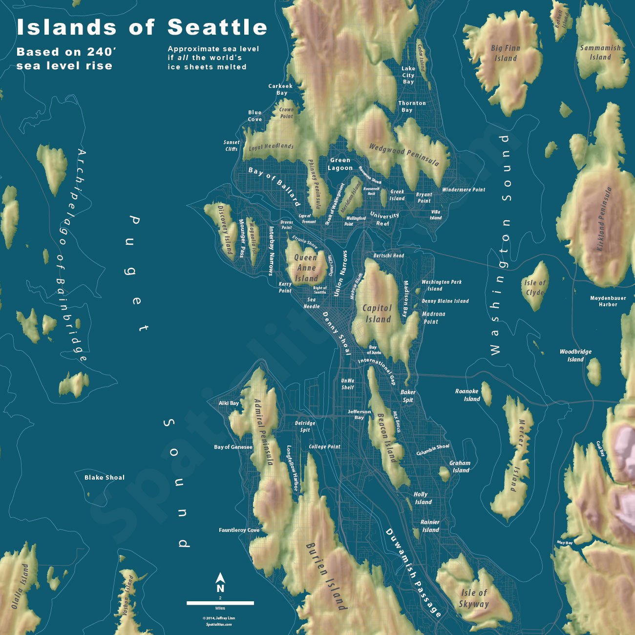
Click to embiggenJeffrey Linn
Here’s L.A. (Hey kids, pack your scuba gear! We’re going to Knott’s Oyster Farm!)
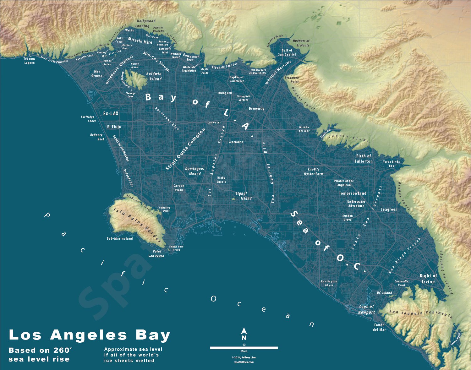
Click to embiggen.Jeffrey Linn
Also in the collection: Underwater maps of Portland, San Diego, Vancouver, and Palm Springs. Montreal is on the way.
Linn is quick to point out that scientists do not predict this kind of sea-level rise in our lifetimes. He adds, however, that “I would imagine that any climatologist would say that this has happened before and will happen again. It’s just a matter of how soon, and what the human race is doing to hasten the process.”
What are we likely to see? In its most recent report, the Intergovernmental Panel on Climate Change predicts that, if we continue polluting the way we’ve been, the seas will rise between 1.7 and 3.2 feet by 2100. But that’s a conservative estimate. A survey of sea-level scientists published earlier this year found that most experts believe the IPCC’s worst-case scenario is actually about the best we can expect if we aggressively cut greenhouse gas emissions, starting now. Failing that, they said, we can expect 2.3 to 4 feet of rise by 2100, and 6.5 to 9.8 feet by 2300. Some believe we could see as much as 16 feet of rise by the end of this century.
Why the discrepancy? Well, there are things we can say with a good degree of certainly about the rising seas. We know, for example, that as seawater warms, it expands. (We can watch it happen, in fact.) But there are other factors that we don’t yet understand, including that small matter of how fast the Greenland and Antarctic ice sheets are melting. And when we do get a glimmer of an answer, it never fails to send us running for the closet in search of our snorkel and flippers.
The debate over how fast the ice sheets are melting is an academic one, really. Toss a storm surge or a hurricane on top of even the mildest sea-level rise, and we’ll see billions of dollars in damage. As Linn points out, the worst of the damage will come long before our distant descendants are navigating the Islands of Portland or Palm Springs Bay with his Total Melt maps. (If you haven’t read the recent investigative series from Reuters on rising seas, I highly recommend it. Unless you’re afraid of sharks.)
Time will tell how quickly, and how high, the waters will rise. In the meantime, Linn would be happy to sell you one of his cartographic creations to hang on your wall. Bet they make for great cocktail party conversation. Or buy one for your favorite bartender to hang at the local watering hole. Drinks on the house!