Running made me see cities in a new way, though I didn’t realize it at first. When I biked, I looked for places that were flat and where cars were least likely to kill me. When I walked, it was almost always in the direction of one of two things: books or food. And when I ran, I thought I was pragmatically just looking for streets where I could go fast and where cars were unlikely to hit me.
Eric Fischer and Garrett Miller of Mapbox, an open-source mapping platform, recently compiled a map of the paths that runners take around the world, and it’s making me think of running in a different light. A look at these maps makes clear that runners — more than I ever realized — follow routes that have some aesthetic payoff.
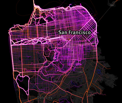
This is San Francisco, where I live now. You can see that runners are all over everything that is either A, a very large park or B, a coastline — even a very windy, cold coastline, like the Great American Highway (to the west), or one with a lot of unpredictably drifting tourist foot traffic, like the Embarcadero (to the northeast).
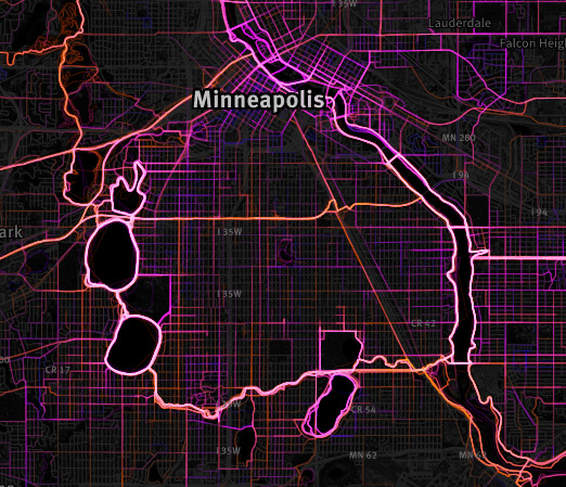
This is Minneapolis, which has a network of foot and bike paths called the Grand Roads Scenic Byway that encircles the city like a ring road. Again, runners are drawn to paths that are next to a body of water. In an interview with Atlantic Cities, Miller describes this as a “fundamental truth” of runner preference that the maps reveal — some kind of primal human urge to run near water. I wonder if it might also have to do with the way that our cities are designed — the longest roads available with the least intersections tend to be along waterfronts. They’re the closest things we have to highways for people.

This project is also a way to scope out which cities are more run-friendly than others, in the same way that Walk Score rates communities on their walkability and bikeability. Detroit has some popular routes for runners, particularly Belle Isle, a park that was plotted out by Frederick Law Olmsted, the same guy who designed Central Park. The outer suburbs of Detroit are almost blank, though, until you reach Royal Oak, a city that, like Detroit’s downtown, was built up in the days before cities were planned around cars.
I’ll add a caveat: The mapping on the project is not exactly precise. It only records the paths taken by users of RunKeeper, which means that it’s more a record of a certain “affluent enough to have a smartphone” and “nerdy enough to track their running habits on said phone” segment of society than of humanity at large. This absolutely explains why, on the map, a country like England is exploding with runners, but it looks like no one in Algeria ever leaves the house.
It’s also unclear at times whether a RunKeeper user is recording a run or a bike ride. Fischer and Miller hypothesize that the longer the individual journey, the more likely it is to be taken by bike, rather than on foot, and so longer journeys are rendered in yellow lines.
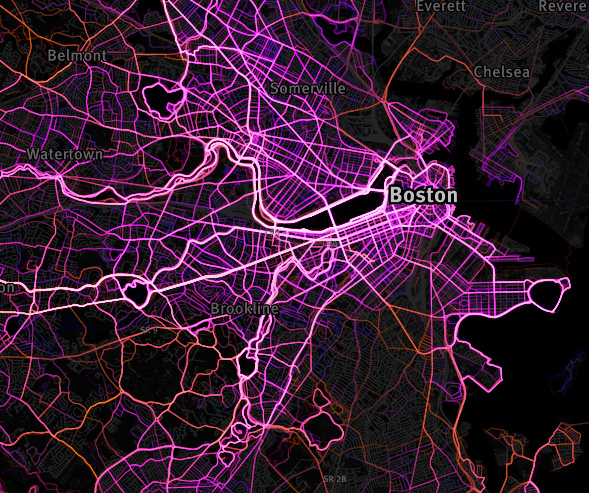
Which leads us to this. I have never lived in a city as mad for running as Boston. It may have something to do with the cerebral nature of the place — people amp up the physical activity in order to compensate for so many hours sitting still and staring at things. What stands out here to me is that Boston is not what I would describe as a fun city to run in: The obstacles are many, the cars are mercenary, and the footpaths are so crowded that runners and pedestrians and cyclists come into frequent conflict. But still, the runners’ paths fan out all through the city — not just the parks and waterfront. What is Boston doing right? Or what is happening in Boston, despite itself? These maps don’t answer that question, but at least they raise it in an interesting way.
Fischer — once a software engineer for Google who just dabbled in maps — has a history of turning the large volumes of public data that have become available in the last decade into maps. He’s mapped out the way that communities are segregated by race and how a city’s residents see a city differently than its visitors do. He was one of a small group of people who set out to walk down every street of San Francisco, and each year he makes a new map of his pathways through the city.
Fischer has described his maps as the product of “a long obsession of trying to figure out what makes some places work and some places not.” More importantly, they are one of the very, very few unequivocally delightful uses of the data that is gathered from all smartphone users whether they like it or not. It’s nice to think that some of it, at least, is being used to understand how cities work, and how they might work better.