Yesterday, I wrote about a new project from the Sierra Club that, basically, lets you get texts from smog. Today, I read about an interactive map created by Marianne Hatzopoulou, assistant professor of civil engineering at McGill University, that lets Montreal cyclists plot their routes through the city, based on which streets have the lowest levels of air pollution. I’m not working off a huge dataset here, but I suspect that something is in the air right now, and that something is smushing together air-quality data and tech.
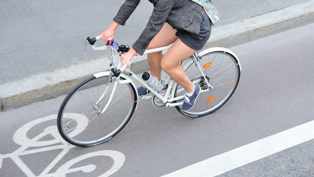
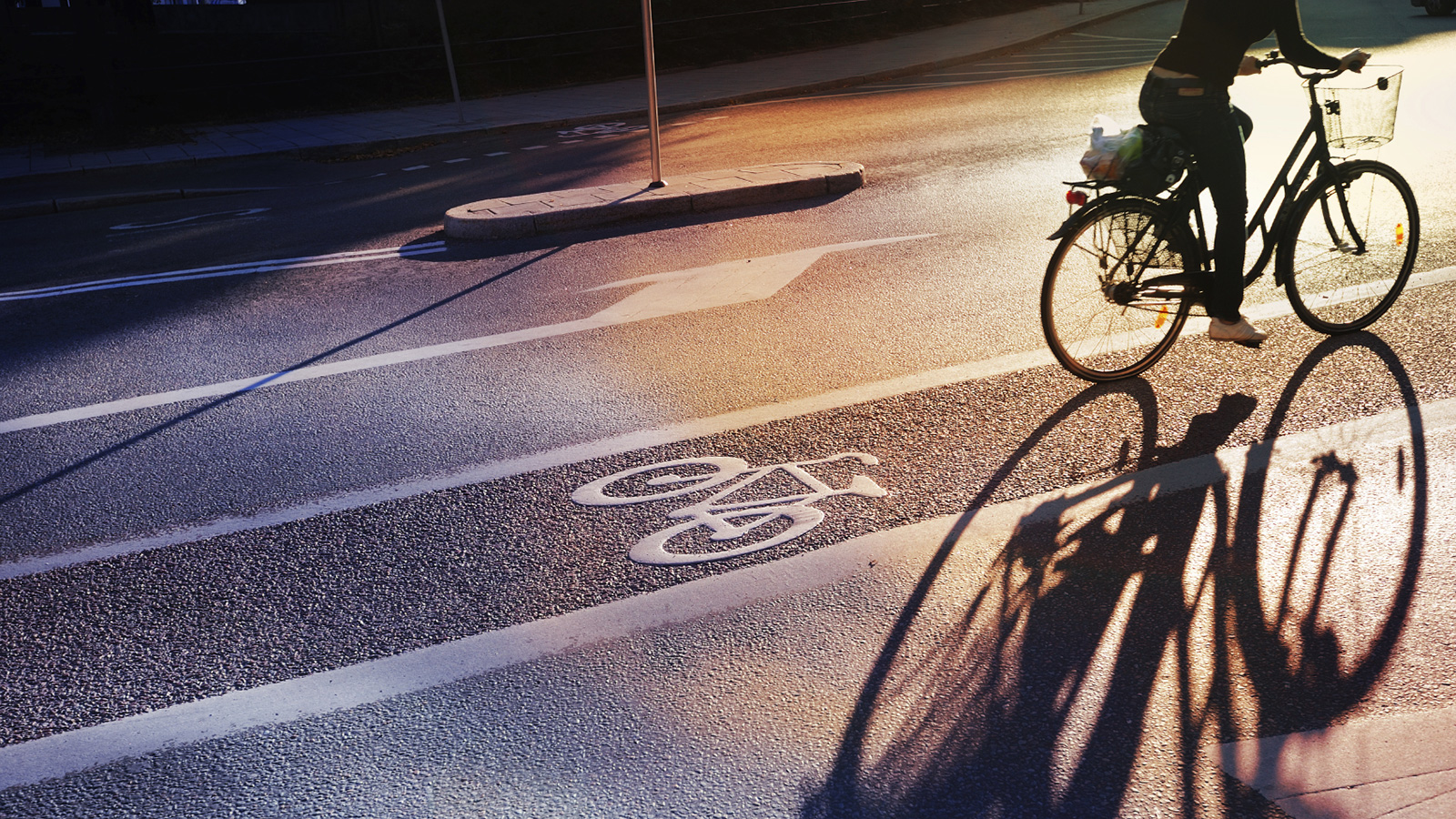
Breathing car exhaust — often at truck-tailpipe level — is one of the great annoyances of biking in the city. As a bike commuter, I’ve made a deliberate choice over the years not to think too deeply about the amount of exhaust I breathe — in the same way that I’ve also chosen not to dwell on how the only thing keeping all the cars around me from killing me is the ability of the people driving them to pay attention. If I thought about this too much, I think I would become much more anxious than I already am, and also probably a jerk.
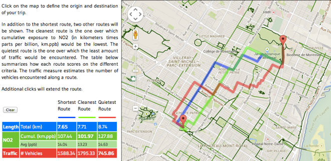
But at the risk of losing my hard-won composure, I decided to take Hatzopoulou’s map out for a test drive. Right away, I ran into a problem. The map itself looks like it was created using Fusion Tables and Google Maps — something which is great for hacking together quick projects, but also has some usability tradeoffs.
For starters, the map didn’t let me input an address for where I’m starting, or where I’m going. Instead, I had to click on the start and endpoint of my journey on the site’s map — a process that involved a lot of zooming in and zooming out. I chose my start point as the Montreal Insectarium, which is one of the happiest places in the world if your idea of happiness is staring at lots of different varieties of beetles (guilty as charged), and ended the route at Notre Dame des Quilles, a local gay bar that has a special place in my heart for featuring both bowling and karaoke. I had trouble clicking on the Insectarium at first because clicking on a landmark activates a Google pop-up that has nothing to do with the map; but once I figured out to not click on any labels, the results were pretty cool.
Getting the data to make the map wasn’t easy. In this case, Hatzopoulou took four years of air sample data that was collected by Montreal cyclists who traveled the city on bikes equipped with $60,000 air-quality sensors. But I’ve run across accounts of similar projects in places like Antewerp, Belgium, and Siracusa, Italy, and prices are likely to come down as people keep tinkering with the technology. This summer, a team of cyclists in New York will embark on a similar project, with the help of a $250,000 grant given to a couple of professors at Colombia University.
If I lived in Montreal, I doubt that I would use this in my day-to-day life. But I bet I would use it as a way to test out whether my regular bike routes through the city were as good for me as I thought. For example: Where I live, San Francisco, I tend to avoid main drags like Valencia — a street that has wide bike lanes, but a lot of car traffic — in favor of smaller streets like Shotwell or Capp Street, which don’t have bike lanes, but also have less traffic, period. I privately think that this is good for my lungs, too — and I’d be very interested in whether or not an air quality sensor would back me up on this.