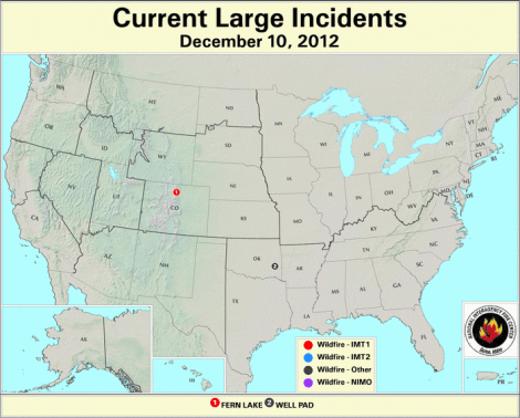
This is the most calm the Forest Service’s active fire map has looked all year.
After all, here was the year 2012 in fires, as compiled by NASA.
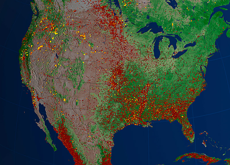
NASA/E360From the description: “Areas of yellow and orange indicate larger and more intense fires, while many of the less intense fires, shown in red, represent prescribed burns started for brush clearing and agriculture and ecosystem management.” Click to embiggen.
Through August, the continental U.S. had seen the most acreage burned by wildfires in history. Happily, that trend didn’t continue. We only came in second.
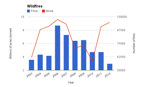
Data from National Interagency Fire Center.
2012 was actually not a bad year for fires as discrete incidents. But notice how few fires did all of that damage. As we noted over the summer, the link between fire intensity and climate change isn’t direct. Clearly, though, the year’s epic drought meant drier conditions — and such drought is strongly correlated to climatic shifts. So it’s not surprising to see that this year’s fires were the most intense in a decade.
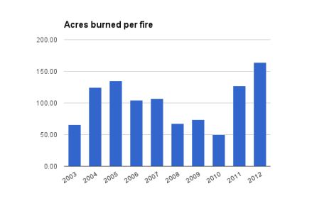
It’s this acres-burned-per-fire number that we don’t want to see rising in the future. Let’s hope this year is an aberration — particularly those of us who live near wildlands.