There was a time in the distant past — call it the late 2000s — when infographics seemed like a good idea. You can pack all kinds of info into a visually appealing file that’s easy to share! What could go wrong?
What could go wrong is that infographics became the No. 1 answer of every middle-aged person in a meeting discussing how to get their organization exposure and create something “viral.” Consequently, the internet is chockablock with terrible infographics — cluttered, over-long flusterclucks that would be better, in every conceivable way, if they were “words” gathered into “paragraphs” to provide “explanations.”
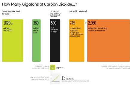
Anyway, infographics are a scourge. Nonetheless, every so often I come across one that’s genuinely informative and helpful. For example, take this one, from the info-ninjas at Information Is Beautiful:
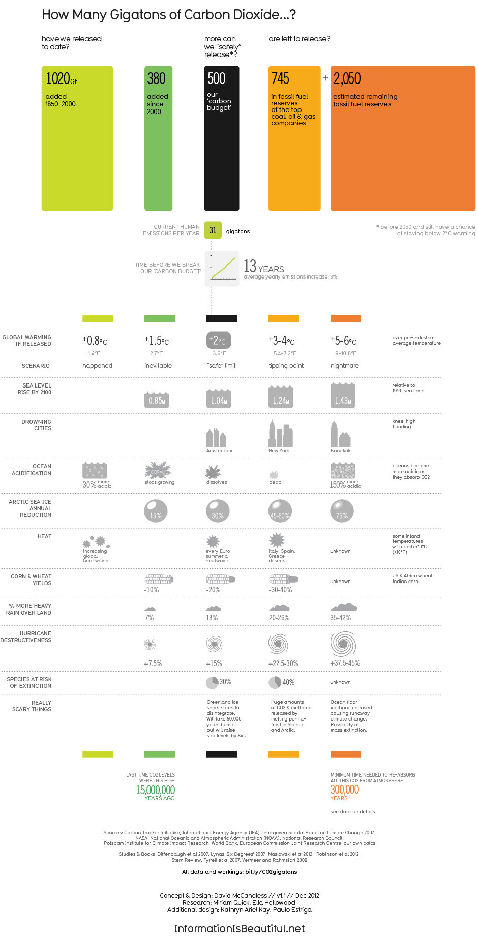
Gorgeous! A compact way of saying what I’ve said with many more words. Share it.