First, the truth:
After a summer of seasonal melting, on Sept. 17, 2014, Arctic sea-ice extent* likely hit its minimum for the year. The official word is that it was measured at 5.02 million square kilometers (1.94 million square miles). This is the sixth-lowest minimum since satellite records began in 1979.
It also fits right in with the overall declining trend of Arctic sea ice:
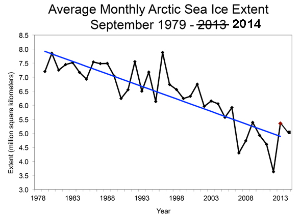
NSIDCArctic sea-ice minimum extents since 1979, when satellite measurements were started. This is the 2013 graph that I extended to add 2014’s minimum. The blue line is a linear fit to the numbers.
As you can see, back in the late ’70s there used to be about 7.5 million square kilometers when ice hit its September minimum. That has dropped to about 5 million now, a decline of 30 percent. As you can also see from the graph, the past eight years have all seen lower ice extent than in the era previous.
This is due to global warming, overall heating of our planet due to human pollution. Dumping 40 billion extra tons of the greenhouse gas carbon dioxide into our atmosphere every year will do that to a planet.
Obviously, there’s no way to see this as good news.
Obviously.
Now, the legerdemain:
Oh, you foolish sheeple. Of course we can see this as good news.
For example, look at the minimum for 2012: It was 3.41 million square kilometers. But the very next year the minimum was much higher, 5.1 million square kilometers. That’s an increase of more than 40 percent! We’re on the road to recovery! Even this year’s minimum is far higher than it was in 2012, so obviously we’re doing great.
Back to the truth:
That’s a pile of horse manure. 2012 saw very unusual circumstances which led to far more melting then normal, so using it as a base point for comparison is unfair, to say the least. It would be just as unfair to look at the unusually large minimum in 1996 and say we had a huge drop after it. You have to look at overall trends. That’s why the blue line is there, and that’s how we know we’re in trouble. That line is heading down.
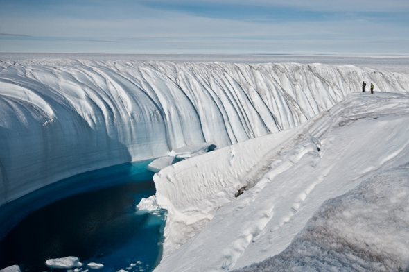
Ian Joughin, University of Washington via NASAOverflow water from a melt lake carved this canyon in Antarctic ice; note the two people on the right for scale.
More shenanigans:
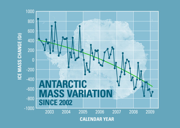
Ah, but that’s only the North Pole. At the South Pole, where it’s winter, Antarctica reached a record sea-ice extent! It surpassed 20 million square kilometers for the first time on record! So much for global warming.
The inconvenient truth:
Part of that is actually true: Antarctic sea ice is at a record high. However, it doesn’t matter overall. That’s because Antarctica is a continent, a huge mass of land. Every year, sea ice around it comes (in winter) and goes (in summer), and over time tends to average out.
Since Antarctica is a continent, it makes a lot more sense to see what’s happening on land, not sea, since that ice should be more permanent (or at least not as ephemeral). But what we see there isn’t good at all.
Land ice in Antarctica is melting. Rapidly. Like, to the tune of 159 billion tons per year. In fact, West Antarctica has lost so much ice that it’s measurably changed the Earth’s gravity in that area!
NASA
Yet even more fertilizer:
But that’s West Antarctica. In the east, ice has actually increased!
Sadly, no:
That was kinda sorta true for a while but is misleading. First, warming waters around Antarctica means more moisture to create snow. Wind blows that around, and some of it fell in East Antarctica, creating mild ice increase.
Note the word “mild.” It wasn’t nearly enough to offset the tremendous loss happening in the west. And now we’re actually seeing increased ice loss in the east, too.
And don’t forget Greenland, back in the north. It’s losing ice rapidly as well.
One more bit of smoke and mirrors:
So what if we lose ice in the Arctic? It won’t increase sea levels, and it means we’ll have easier access to shipping routes!
Long, drawn-out sigh:
That’s more baloney, as Jon Stewart aptly showed recently. Losing land ice means sea levels will rise, and if we lose a lot of ice in Greenland and Antarctica — which we are very much on track for doing — sea levels could rise several meters. That would be catastrophic. Incidentally, salty sea water and clean melt water have different densities, so losing sea ice does in fact raise sea levels, though not as much as land ice loss.
By the way, some fossil fuel companies are excited about Arctic sea-ice loss, because it gives them easier access to oil under the sea in the north. BANG! There goes my irony gland again.
So what does this all mean? Ice loss is an obvious indicator of a warming planet. Both poles are melting, so there you go. And it’s a bigger problem than just rising sea levels (which is a very, very big problem): Northern sea ice has been shown to affect overall weather patterns. Those bone-chilling cold snaps the U.S. East Coast has seen recently, heat waves in Alaska, and more are quite possibly connected to a weakening boreal jet stream due to warmer waters in the Arctic.
Got it? We’re destabilizing the climate system of our entire planet. We don’t know what exactly will happen as waters warm, as ice melts, as temperatures rise over years and decades. But we do know it means big changes, and we depend on the climate the way it is to support the seven billion souls on Earth, and those who will come after.
Monkeying around with our own planet is insane. Lying about it is even worse. We need to take global warming seriously, and we need to take action.
*“Extent” is essentially how much area of the Arctic was covered by ice; technically, though, area and extent are slightly different.
 This story first appeared on Slate as part of the Climate Desk collaboration.