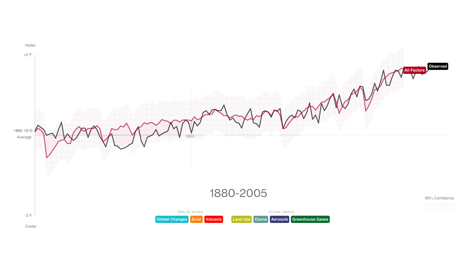
Perhaps you’ve had one of those conversations about climate change where someone lists all the things — other than us people burning carbon — that could be making the weather go haywire in recent decades. There’s ozone pollution. The Earth’s orbit. The way we keep on cutting down trees and setting them on fire or making stuff out of them. Volcanoes! The relentless heat of that dear ball of incandescent gas that the Earth rotates around! Big hair in general, and old cans of Aqua Net in particular!
Those conversations can cease. Blooomberg Business just put together a graph plotting each of those different hypotheses in an overlay with the culprit scientists favor — greenhouse gases. The result is a thing of beauty, worth clicking through and studying closely.
The data comes from climate model E2, which was created by NASA’s Goddard Institute for Space Studies (GISS), and which runs on a supercomputer at the NASA Center for Climate Simulation in Greenbelt, Maryland. The graph ends in 2005 because that’s as far as the GISS numbers go. With the kind of jaw-dropping clarity the Bloomberg graphic provides, now NASA has a great reason to update that data.