I love maps. I love watching how maps change with our changing priorities. During election cycles, they’re all about shades of political affiliation. When the economy’s bad, they’re about who’s poor and who isn’t, and when weather’s bad, they’re all about the weather (and, increasingly, climate change). Last year, I saw a plethora of gorgeous maps that were transit-related. This year, I saw hardly any.
My bias is towards maps that are easy to figure out and use, which unfortunately means leaving out a lot of gorgeous things that I am tempted to talk about anyway. The most ambitious mapping project of the year, American Panorama, proved cool to look at but frequently a hot mess to actually use. Same with this project that has set out to geolocate environmental stories onto a world map.
It’s easy for this kind of thing to happen. Putting a map online is so full of possibilities that it’s hard not to turducken the whole project and stuff everything you have into it, even if that makes it a total browser-freezer.
This year, I’ve spotted multiple projects that are designed to make it easier to make use of the great outdoors — CaliParks, FindYourPark, as well as the private startup Hipcamp (which was founded in 2013). I haven’t had much luck with them yet while traveling, compared to my time-honored tactic of just asking friends and random passersby for advice. But I think that the idea, and the open data initiative behind them, is a good thing.
So what maps made me think the most this year? Without further ado …
I mean, you knew it, but still: Miami is sinking
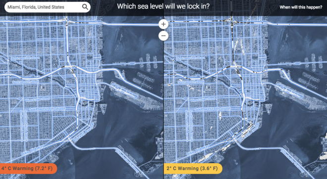
Climate Central
Maps that model sea-level rise from climate change are nothing new. Last year, for example, we gave a shout-out to Seattle mapmaker and urban planner Jeffrey Linn’s unsettlingly attractive maps of American cities after all of the ice caps have melted. This map from Climate Central, built on a new study in the journal Proceedings of the National Academy of Sciences, may be less “pretty enough to frame and put in the breakfast nook” than previous efforts, but it’s also way bigger — and has the additional feature of letting interested parties type in the location of their choice and explore both a 2 degree C and a 4 degree C warming scenario. (Miami is completely underwater for both of them.)
Also: If you like to see things animated, the New York Times fake-flooded several cities in China using the same data. Also: How does Miami feel about its situation as the most-doomed-American-city-that-is-not-New-Orleans and poster child for climate change illustrations? Surprisingly unalarmed, that’s what.
How does Iowa feels about climate change, anyway?
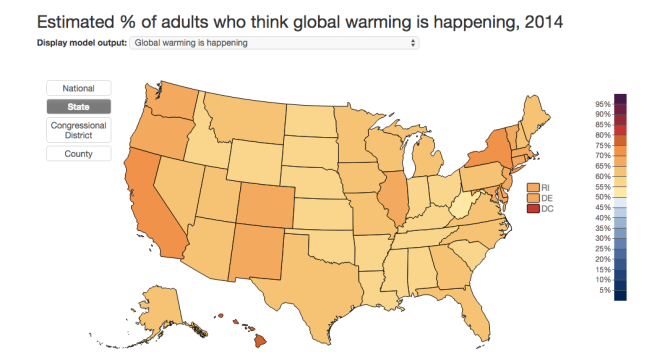
YPCC
In short, more than half of Iowa thinks that climate change is happening, but less than half of Iowa thinks people are causing it. This map, put together by the Yale Project on Climate Change Communication from data collected in 2014, is based on the working paper “Geographic variation in opinions on climate change at state and local scales in the USA,” published in Nature Climate Change. This is not a flashy map, but it’s easy to get information out of.
Let’s all be very, very disappointed in Los Angeles
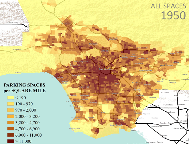
Los Angeles has a lot going for it: The city is in the middle of building out a transit system that is one of the largest public works programs in the United States. The city may have a reputation for sprawl, but it’s surprisingly dense in population (3,000 residents per square kilometer). Retrofitting its suburban design for pedestrians and transit won’t be easy, but there will be no shortage of users.
On three separate occasions, Los Angeles has raised its sales tax in order to fund more mass transit, and it will probably try again in 2016. The city’s sustainability plan requires that in 20 years, at least half of all journeys in L.A. will be taken on foot, by bike, or by using public transit.
So this map was a huge surprise to me. I had no idea just how much of Los Angeles has been given over to parking, even during the post-2000 shift towards transit.
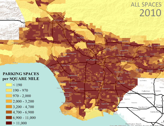
Why is this? The researchers who put together the map blame parking minimums — the requirement that new construction must provide parking spaces for future residents or visitors. Parking minimums are popular with neighborhoods that are worried that a new building is going to take up all the public parking spaces, and getting rid of them can be tough. But parking minimums are an incentive to own a car, which means that they both clog the roads further and hike up the cost of new construction.
It’s entirely possible that Los Angeles’s parking minimums are not long for this world. They’ve already been eliminated in one section of the city — as this crowdsourced map put together by Strong Towns, the land-use obsessed nonprofit, shows.
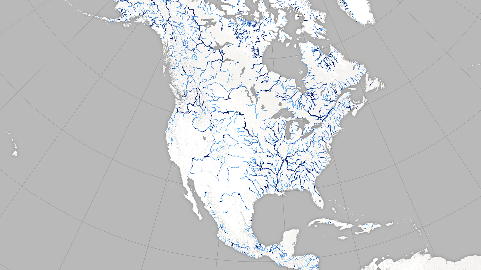
NASA is here to help you nerd out over America’s rivers
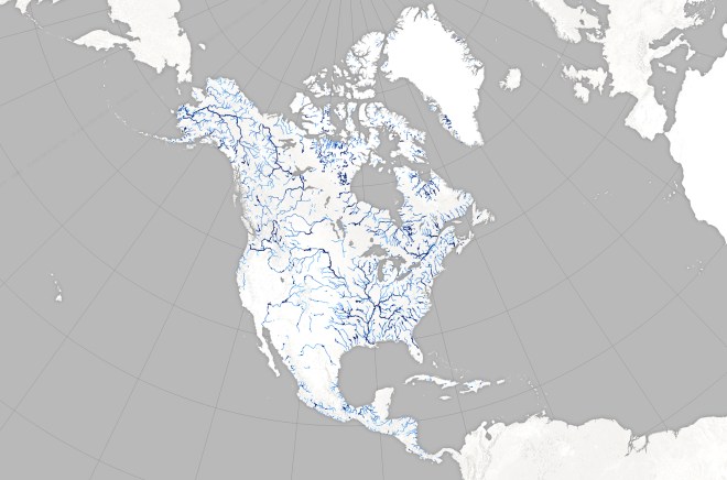
This map was created by Joshua Stevens at the NASA Earth Observatory, from a new database of river widths for North America that was built by two hydrologists at the University of North Carolina from thousands of satellite images of the Earth.
This is all preparation for 2020, when the Surface Water and Ocean Topography mission — a collaboration between NASA and France’s Centre National d‘Etudes Spatiales — intends to launch a satellite that will map water around the world in even more detail.
Human civilization, as my high school history teacher put it, always develops near a river. And this creates — automatically — a certain degree of conflict, because rivers and people don’t always have the same agenda. The Mississippi River, for example, has been trying to migrate for over a century, while the humans who live around it need it to stick to its circa 1900 pathway, to keep real estate values high and communities dry. Meanwhile, the dramatic weather patterns that go hand-in-hand with climate change are making floods both more frequent and more expensive.
In other words: In the future, understanding rivers will be even more important. I like how this map is a first step towards trying to understand a world that keeps on changing around us. That’s how it goes: Some maps are about changing the world, some are about seeing it the way that it was, and others are about understanding it the way it is now. Happy 2015, y’all — here’s looking forward to how we all try to chart the year 2016.