The temperature anomaly in the Arctic — the amount that current temperatures differ from historical norms — is now so severe that NASA's James Hansen had to add a new color to his charts in order to accurately depict it: Hot pink.
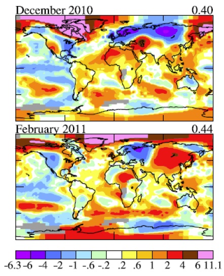
In other words, last winter the Arctic was more than 10 degrees C (18 degrees F) warmer in than its historical norm (which is defined by the average of temperatures from 1951-1980). So NASA’s scale, which previously topped out at dark red, had to go to 11.
Kate at ClimateSight deserves full credit for noticing this disturbing new trend in chart coloration. No word yet on what comes next, as a warming planet inevitably stretches the bounds of Hansen's box of Crayolas. Atomic Tangerine? Banana Mania? C'mon people, let's at least have some fun with it!