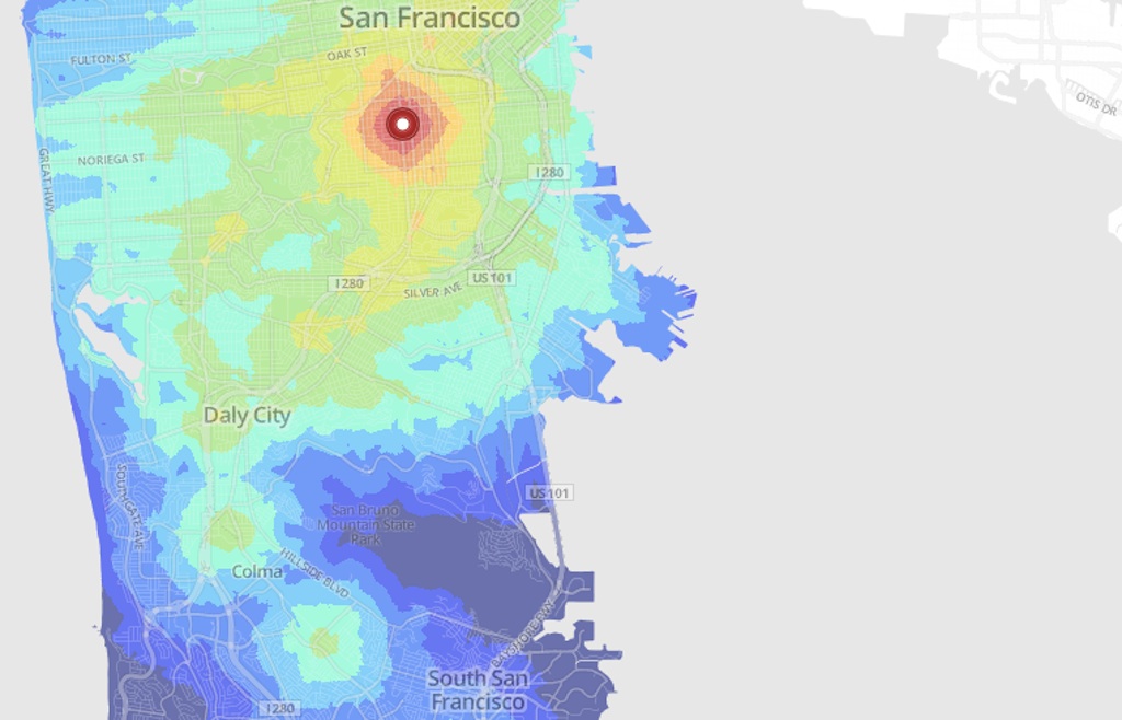
Andrew Hardin, a grad student at the University of Colorado, designed these neat, colorful maps that show how long it will take you to move around Boulder, Denver, San Francisco, or Seattle using public transit. Just click any point on the map, and colors pool out around it — like a heat map, but for time spent on buses or subways.
These maps aren’t meant to tell you exactly how minutes it’ll take a person to get from her front door to a favorite restaurant. FastCoExist:
Hardin’s maps, which are based on Open Street Map data, aren’t completely accurate. For example, they assume people cross rivers directly, when normally people take bridges or tunnels. “Frankly, better tool exists for planning your commute,” he admits. The point is to offer approximations, so you know immediately how far two destinations are from each other.
But they show something more interesting than commute times — the shape of city, as determined by its public transit. You can see, for instance, the impact of train stops, which create distinct circles of time around them, like drops of food coloring on a liquid surface.