The NASA video above shows temperature anomalies — not how warm or cold the Earth was, but how unusually warm or cold it was, compared to a baseline. It’s a ton of data — 130 years’ worth, which means 1,560 months, which means more than, really, any one person can comprehend in a sort of folksy “wow, it’s really cold this year” way.
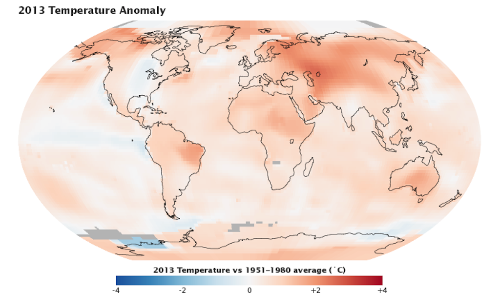
If it’s not clear, the creeping trend is more pink and red — more frequent months that are abnormally hot. 2013 was one of the hottest years in the past 130.
Even watching the video, it’s hard to remember how things used to be. But flip back and forth between the beginning and the end, and you’ll see: In the beginning, there was blue. Now, in black and white, it’s red all over.