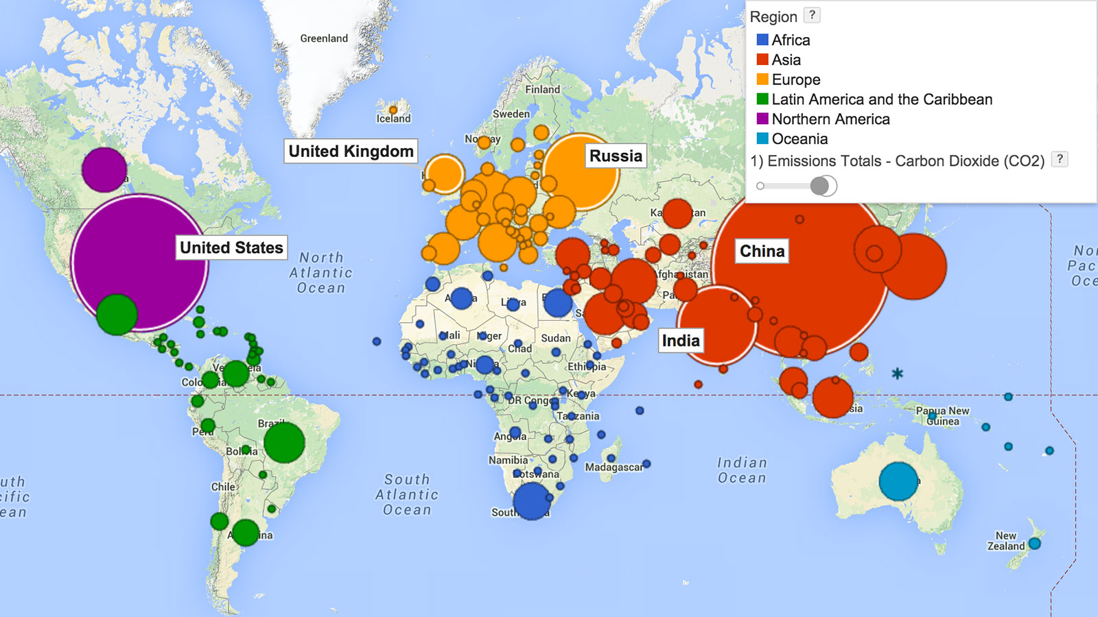
The Chinese get a bad rap when it comes to carbon emissions, but they’re hardly the worst offenders. The U.S. was the world’s lead carbon emitter for decades before China took the stage.
Want to see what that looks like? Check out this crazy timeline, developed by the World Resources Institute. The big, scary, colored bubbles burgeoning over the last 160 years represent exploding CO2 emissions. The map illustrates what’s usually a point of contention at climate talks — that rich countries’ culpability in this whole shitstorm far outweighs poor countries’.
[protected-iframe id=”729f0c7ec90aac698cf7c54392fb04e4-5104299-30178935″ info=”http://www.google.com/publicdata/embed?ds=cjsdgb406s3np_&ctype=m&strail=false&bcs=d&nselm=s&met_s=emissions&fdim_s=emission_type:co2&scale_s=lin&ind_s=false&dimp_c=country:region&idim=country:185:36:143:77:184&ifdim=country&hl=en_US&dl=en&ind=false&xMax=119.18477625000003&xMin=-116.36209874999997&yMax=-36.235183705467016&yMin=65.48118476345574&mapType=t&icfg=z4fano7krp1dr4_%253A9%253Acountry%26%26128:-76:-22:%7Ccjsdgb406s3np_%253A14%253Acountry%26%26143:5:-24:%7Ccjsdgb406s3np_%253A14%253Acountry%26%2677:-50:3:%7Ccjsdgb406s3np_%253A14%253Acountry%26%2685:40:11:%7Ccjsdgb406s3np_%253A14%253Acountry%26%2636:-55:-25:%7Ccjsdgb406s3np_%253A14%253Acountry%26%26185:32:-23:%7Ccjsdgb406s3np_%253A14%253Acountry%26%26184:-137:-30:&iconSize=0.9″ frameborder=”0″ style=” width: 660px; height:400px;” scrolling=”no”]
President Obama’s speech at the recent U.N. Summit paid homage to the idea that the U.S. had better fess up. But as Fast Co.Exist reports, although the Chinese are now contributing 28 percent of the world’s carbon output, at least they’re open to putting a price on carbon, unlike you-know-who. What gives, America?