A few years back, as a graduate student, Takatsugu Kuriyama made a 3D model of Tokyo’s tangled subway system. In his map, the brightly colored tubes swoop up and down, running over and around each other like the tracks of one of the nuttiest roller coasters ever:
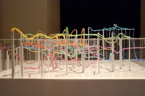
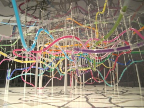
Or here, watch it up close:
If you plan on riding these trains, you needn’t bring a barf bag, though. Although they’re based in reality, those peaks and valleys don’t exactly represent what it feels like to ride on the Tokyo subway. Spoon & Tamago, which covers Japanese design and culture, writes:
There’s been some understandable questions raised about the map’s accuracy given the volatile dips and turns. @tokyoreporter pointed me to this graphical map that was done in 2003, illustrating the depths of some of the metro lines. As you can see, the two maps share many of the roller-coaster-qualities. I think what’s happening is that the magnitude of the dips and twirls are being exacerbated when they’re compressed onto a small plane.
The tool used to measure subway depths — stairs from ground to platform — isn’t exactly the most scientific, either. Kuriyama’s model is less of a map than a clever and bright representation of how frickin’ complicated it is to move masses of people from one place to another in a single city, day in and day out.