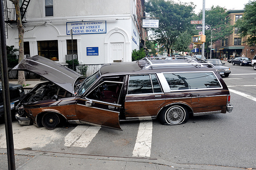
A hopefully non-fatal accident.
The National Safety Council yesterday released its estimates of 2012 motor-vehicle deaths in the United States. And: bad news. From the report [PDF]:
Motor-vehicle deaths up 5% in 2012.
Motor-vehicle deaths in 2012 totaled 36,200, up 5% from 2011 and marking the first annual increase since 2004 to 2005. The 2012 estimate is provisional and may be revised when more data are available. The total for 2012 was also up 2% from the 2010 figure. … The estimated annual population death rate is 11.49 deaths per 100,000 population, an increase of 4% from the 2011 rate. The estimated annual mileage death rate is 1.23 deaths per 100 million vehicle miles traveled, an increase of 4% from the 2011 rate. …
The estimated cost of motor-vehicle deaths, injuries, and property damage in 2012 was $276.6 billion, a 5% increase from 2011. The costs include wage and productivity losses, medical expenses, administrative expenses, employer costs, and property damage.
The deadliest month on the roads was July, followed by August and June. The safest: February — not a surprise, since it’s the shortest month.
The NSC also provided state-by-state data, which is revealing. Last November, we looked at a report suggesting that red states were more likely to experience traffic deaths. That report used preliminary data — but the data released yesterday seems to reinforce the idea. You wouldn’t notice it looking at the raw, per-state data, however.
Speaking of:
Deaths per month
[protected-iframe id=”3257919a78a84e5381a3cbd16127b9f9-5104299-30176283″ info=”http://pbump.net/files/grist/roaddeath.php?c=1″ width=”470″ height=”320″ frameborder=”0″]
Darker shades mean higher overall numbers. Not surprisingly, states with larger populations have more road deaths. (There was no data for Vermont.) This doesn’t tell us very much.
Population per road death per month
[protected-iframe id=”118e14482f01001680bda9d6f9ed4520-5104299-30176283″ info=”http://pbump.net/files/grist/roaddeath.php?c=2″ width=”470″ height=”320″ frameborder=”0″]
In the map above, a lighter color means a bigger number, which is good — it suggests that there are fewer road deaths as a function of population. Montana, Wyoming, the Dakotas, New Mexico, and the South have more road deaths by population than many other states — reinforcing the link between red states and traffic deaths. New York’s rate of death as a function of population is relatively low.
Rate of change since 2011
[protected-iframe id=”ecef03341841438c9fc88ce6e0584de9-5104299-30176283″ info=”http://pbump.net/files/grist/roaddeath.php?c=3″ width=”470″ height=”320″ frameborder=”0″]
Darker shades mean an increase in the number of deaths; lighter shades mean a decrease. Interestingly, the Northeast has seen a larger increase in the number of road deaths than many other regions. Two adjacent states saw the biggest changes — South Dakota went up, Wyoming went down — but this is largely because they have small populations, making percentages more volatile.
The moral of the story is this: If you don’t want to die in a car accident, move to New York. Or go back in time to 2011. Or don’t leave the house. All viable options.