I love maps to a ridiculous degree — I even worked on a book of them once, a gig that involved drinking straight vermouth with a woman in her nineties who railed about how the Golden Gate Bridge, when it was built in 1933, “spoiled the view.” Maps take history and perspective and lay it over the landscape. This makes them among the most elegant and comprehensive devices out there for conveying information about how climate change is doing its thing all around us.
Some of the best maps this year were laden with bells and whistles. I’m a fan of the Audubon Society’s flashy interactive map of how climate change will affect the range of 314 North American bird species — but because it’s so interactive, it’s best just to go to their website and experiment for yourself. Ditto with the strange dystopian disco-ball Earth made by the Global Weirding project, which remixes mountains of data from the most comprehensive climate-change study ever produced into an interactive timeline that shows how the future of the world might look, complete with hypothetical headlines like “May 25, 2076: Marshall Islands drown – is it still a nation with fishing rights?”
My very favorite maps of the year were the simple ones, because I still have a bias towards flat things that you can stare at. (The world is interactive enough as it is.)
Here are the environmental maps that taught me the most this year. Some of them are pretty, but more importantly, all of them are informative. If you’ve seen something great that you think our readers should know about, post it in the comments.
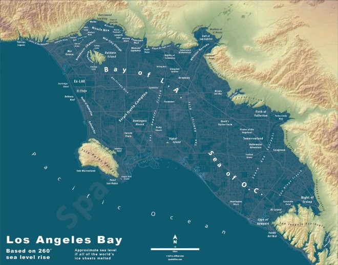
click to embiggenJeffrey Linn
Cities (not) on ice
Seattle mapmaker and urban planner Jeffrey Linn likes to make maps of American cities after all of the ice caps have melted. You know, for fun. Predicting our underwater future is a complicated business, but Linn approaches it with a charming sense of wonder – especially when it comes to renaming underwater landmarks.
If you can’t get enough of underwater cities, check out this older map of the “San Francisco Archipelago,” and this New York Times series.
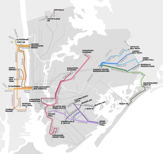
Dollar dollar vans, y’all
The dollar van is like Uber and Lyft without the marketing, or lobbyists, or the Google Bus without the ID scanners. They’re privately owned vans that operate along routes that are underserved by transit, serving mostly working-class, immigrant neighborhoods. They’re also almost entirely illegal — which doesn’t stop them, but keeps them operating at a low profile. This is too bad; as Lisa Margonelli wrote in the Atlantic a few years back, “The dollar van fleet is a tantalizing demonstration of how we might supplement mass transit to include privately-owned mini-transit entrepreneurs, giving people alternative ways to get around, and creating jobs.”
This map was compiled this summer for the New Yorker by Aaron Reiss, a journalist and cartographer based in Manhattan’s Chinatown. It lays out the main dollar van routes operating in Manhattan and New York’s outer boroughs. This network carries 120,000 riders a day; if it was owned by a single operator, it would count as the 20th largest bus service in America.
It’s worth reading the essays that go with each route, each one a glimpse into the ways that dollar vans differentiate to attract clientele. A 24-year-old van driver who goes by the name Skates, for example, “operates one of the most recognizable vehicles on Flatbush, outfitted with a massive sound system that can project inside and outside the van, plus fifteen synchronized television screens that broadcast a steady stream of rap and hip-hop music videos.”
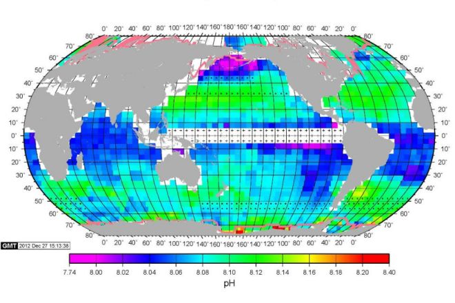
Click to embiggen.Takahashi
How acid is my ocean?
About a quarter of the carbon dioxide we release winds up in the ocean, where it becomes bad news to any critter that likes to build itself out of carbonate. This map, four decades in the making, is the benchmark for studying future measures of ocean acidification. As you can see, there’s a lot of variation across the briny seas. The map was put together by a team of geochemists at Columbia University, and published in the journal Marine Chemistry.
Road rules
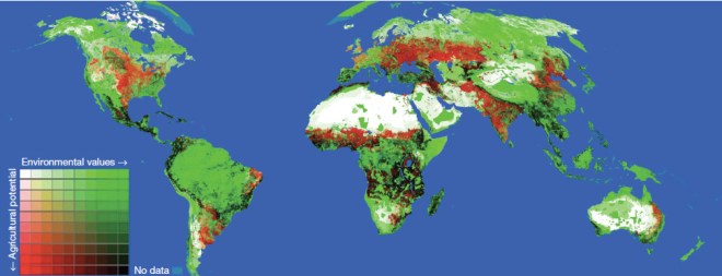
If you happen to have a wilderness or reasonably intact ecosystem on your hands, one of the most low-cost, effective ways to keep it that way is to not build roads there. As a planet, right now we are on a road-building spree — 15 million miles of new roads are anticipated by 2050, which would mean a 60 percent increase in the total length of roads over what the planet had in 2010.
The red areas here are places where the researchers think more roads are a great idea — the land is great for agriculture, and roads will help farmers get food to market. The green areas are not great for farming, but great for wildlife — meaning that roads aren’t a great idea, since they’ll enable poaching and development. The black areas are where those two uses come into conflict: the area is biodiverse, but there is also a strong need for more agricultural land.
As you can see, Central America is looking like trouble, but there is little to stop one, morally, from farming the hell out of southern Michigan.
This map was built by an international crew of researchers from Australia, Malaysia, the UK, and the US, and one could say that it is so much champagne wishes — an intellectual exercise set in a world where the tradeoffs between nature and development are actually taken into account before a government or a company or an NGO lays a nice paved road down in a place that hasn’t had one before.
Does this world exist? Maybe not. What is true is that this map, like all of these, is a new perspective. In fact, drawing up a good new map is also building a new way of seeing things. Here’s to the year 2015 and the new perspectives that lie in store for us.