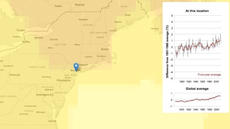
New Scientist has this neat tool that lets you see how average temperatures in specific locations all around the world have changed over the past 120 years or so. Just stick in a city and country, and you can find out how totally screwed you are. For instance, here in Brooklyn, N.Y., we are only moderately screwed.
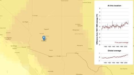
Whereas in Phoenix, it’s not looking so hot. Metaphorically. Technically, it’s looking pretty hot indeed:
You can also go back in time. On the map, that is. In real life, forward is the only way to go, and, based on these trend lines, we’re feeling a little nervous about that.