Remember that totally shareable animated graph that showed global temperatures spiraling out of control in a terrifyingly literal way?
If you enjoyed that sciencey Eye of Sauron, you’re in for a treat: There are two new colorful spirographs to demonstrate further how we’re dragging Earth through the mud.
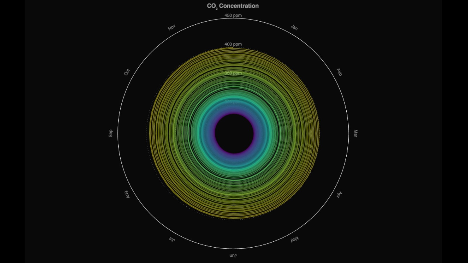
One shows the increase in global mean CO2 concentrations since 1850:
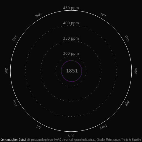
Global mean CO2 concentrations since 1850. Gieseke and Meinshausen (2016) Climate Spirals from emissions to temperatures, available at: www.pik-potsdam.de/primap-live/ or climatecollege.unimelb.edu.au/climate-spirals
The other charts our adherence to the carbon budget. In other words: how well we’re keeping global warming below the Paris climate agreement cap of 1.5 degrees C; 2 degrees C at the most. (Verdict: not too well.)
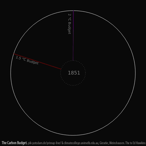
The use of the global carbon budget. Gieseke and Meinshausen (2016) Climate Spirals from emissions to temperatures, available at: www.pik-potsdam.de/primap-live/ or climatecollege.unimelb.edu.au/climate-spirals)
Seen altogether, the three graphs demonstrate a clear relationship between carbon emissions, global temperatures, and our (so far) ineffectual efforts to contain the problem.
But, there’s hope. At the very least, we haven’t yet blown past the 1.5 degree C ceiling. As the scientists point out in the Washington Post: “The spirals clearly suggest that if greenhouse gas emissions are halted and global carbon concentrations are allowed to stabilize, then global warming will ultimately plateau.”
Honestly, watching the climate coils speed up crazily past the noughties reminds us forcibly of Dante’s descent into the circles of Hell.