infographic
-
![]()
![]()
We broke down the last decade of climate change in 7 charts
Where did the past 10 years get us? These seven charts below begin to hint at an answer to that question.
-
![]()
![]()
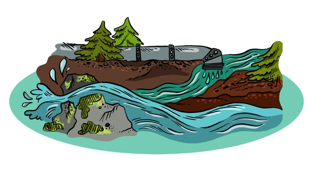
This infographic shows what could happen when the nasty stuff in your bathroom products washes down the drain
Triclosan, an antibacterial agent, could be mucking up our ecosystems.
-
![]()
![]()
Fast-food burgers have tripled in size since the 1950s
According to this chart from the CDC, fast-food burgers have more than tripled in size since the 1950s, going from four ounces (i.e. a quarter pound) to a whopping 12. And if you think that’s bad, the average soda is six times as big as it used to be.
-
![]()
![]()
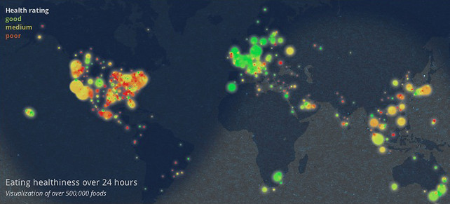
Infographic: The later it gets, the more crap we eat
I don’t have to tell you that people eat crappier food late at night than they do in the light of day. You probably figured that out when Taco Bell invented a fourth meal in the middle of the night. But according to Massive Health’s interactive map of self-reported food quality, we’re on a slippery […]
-
![]()
![]()
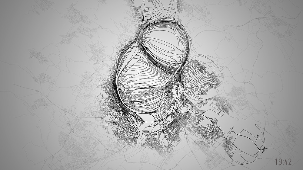
Mesmerizing data visualization shows a day in the life of a city’s bike usage
[vimeo 40866482][vimeo� This video is probably what Ralph Steadman sees when he takes half a tab of acid and looks at a map of Budapest, but it’s also a data visualization of the city’s bike usage during a 24-hour period. The size, location, and direction of the bubbles reflect how many people are on bikes at […]
-
![]()
![]()
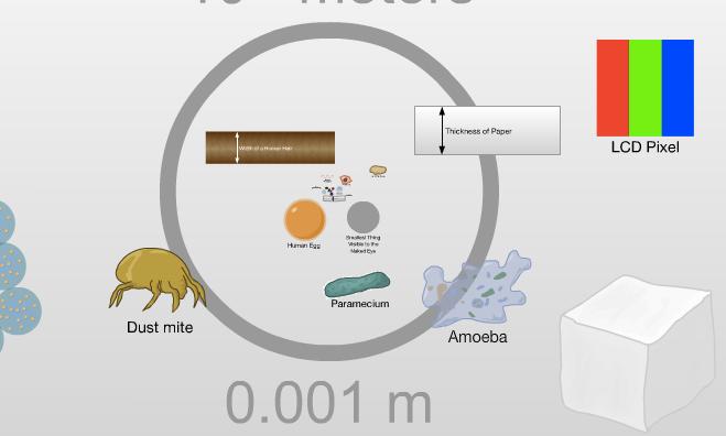
Website shows you your place in the universe (and yes, you are very very small)
The Scale of the Universe is a web-based Total Perspective Vortex that will make you feel very very small — or very very large — with the swipe of a mouse. You start at the scale of humans/dodos/giant earthworms, and from there you can zoom up to galaxies and down to quarks, or you can […]
-
![]()
![]()
Walmart is bigger than Manhattan and richer than Norway
Mother Jones sized up the retail giant. Here's what they found.
-
![]()
![]()
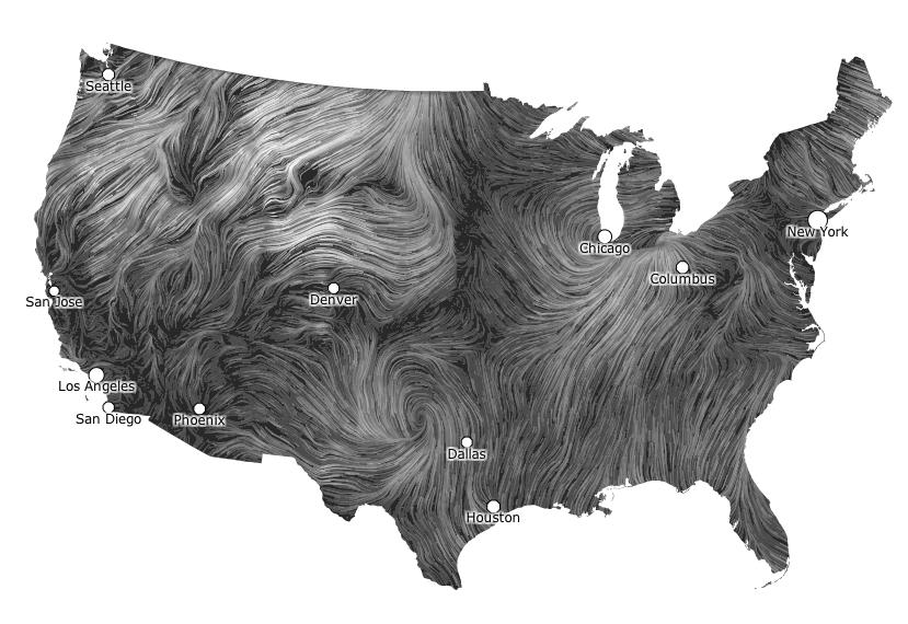
Mesmerizing wind map is the coolest-looking weather map ever
Data visualization wizards Fernanda Viégas and Martin Wattenberg have devised a real-time map of wind speeds in the U.S., and it beats the pants off spiky cold fronts, happy suns, and whatever else they’re putting on weather maps these days. It’s simple, elegant, and crazy hypnotic — watch it together with the lava lamp ocean currents, and […]
-
![]()
![]()
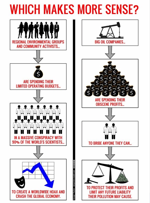
Infographic: The idea of a climate change hoax makes no $)%*@ sense
Here's a graphical representation of why the idea of a vast worldwide climate conspiracy is just silly.