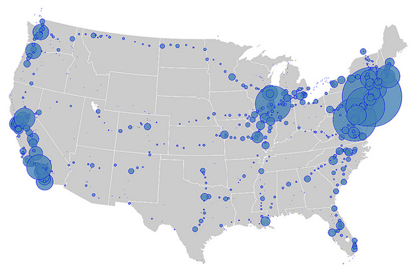
Remember that beautiful map that imagined what the country’s high-speed rail network could look like? Well, in case you felt happy or optimistic after looking at it, here’s a map, via Atlantic Cities, that shows the depressing reality of American rail:
Those bubbles represent the ridership for various Amtrak stops around the country. It’s no secret that the Northeast Corridor line is the system’s most popular, but you can get a sense of how much more used it is than any other bit of the system. And long distance, cross-country lines? They barely register.
To a certain extent, the more popular stops just denote more populous areas. But that’s not the whole story, as Atlantic Cities explains:
Texas, for example, has three of America’s ten largest cities: Dallas, Houston, and San Antonio. But the inexplicable lack of a direct rail connection between Houston and Dallas makes the state look, on Hicks’ map, emptier than Missouri. In fact, the nation’s second-largest state had only 465,000 riders in 2012. Missouri, meanwhile, had 739,000.
Other states suffer from a similar routing problem. Ohio, though crossed by regional routes on its northern and southern borders, has no train at all connecting the state’s major cities. It has one-fifth [PDF] the passenger train traffic of neighboring Michigan [PDF].
In other words, American rail is failing because it’s ass-backwards.
This gives us a whole different vision for our epic train adventure. This is one where we set off alone, looking for a little bit of solitude and good old individualism — and we find it by taking the train across North Dakota and Montana, with almost no other passengers in our train car. That actually sounds pretty good! But not as good as a quick, painless, car-free commute between San Francisco and Los Angeles — or, god forbid, between Dallas and Houston.


