Ever wondered what a year’s worth of carbon dioxide emissions looks like in our atmosphere? According to NASA’s new climate visualization, which condenses all the activity into a few minutes’ time, it’s surprisingly as beautiful to watch as it is worrisome.
Called a Nature Run, the video simulation depicts greenhouse gases swirling and circulating around the globe, riding on the tails of the world’s changing weather patterns.
It’s apparently one of the most detailed climate visualizations we have yet, Wired reports:
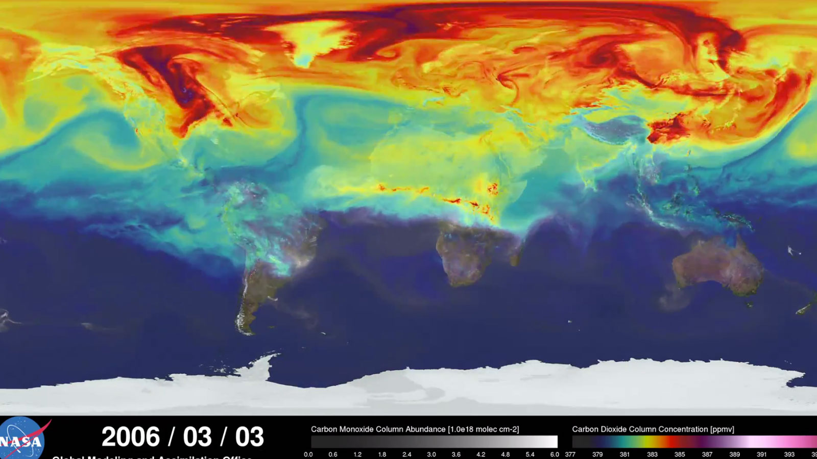
The video covers January 1st to December 31, 2006, and it clearly shows that much of the world’s CO2 comes from the heavily populated northern hemisphere (PROTIP: Click settings and watch the video in 1080p). At times entire continents are obscured by carbon dioxide, then the levels fluctuate as photosynthesizing plants gobble up the gas. Periodically, the southern half of the world flares up, because of seasonal forest fires in central Africa, for example. NASA hopes that the scientific community will use the models to get a better understanding of how not just CO2, but other particles like dust, sea salt, and ash, swirl and settle around the globe.
Future Nature Run videos are only bound to get more precise, as they’ll use readings from NASA’s first satellite specifically intended to study carbon dioxide levels from space. While we’re excited for those future vids, and what they’ll tell us about our role in global carbon emissions, we can only hope someone figures out how to turn the simulation into a kickass lava lamp for the sake of stoned climate geeks everywhere.