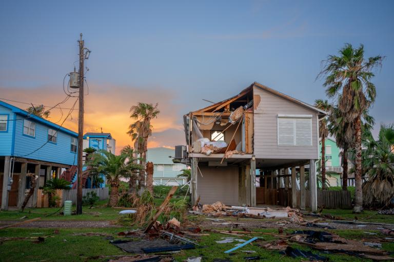
I’ve been visiting a wide variety of environmental blogs lately to get my daily dose of information and commentary. I have settled on eighteen feeds that I visit most days, opening tabs to articles of interest from each to be read right away or later in the day. This has given me the opportunity to compare sites. I discuss a select few below in no particular order.
There are some sites that I dread simply because it takes so long to load. The Huffington Post is one of those. My computer clicks and groans while it battles with pop-ups and dozens of interactive ads after clicking on the blog site. It happens all over again when I pick an article to read and again if I want to read another article because you have to hit the back arrow and suffer through this one more time. They need a clean list of article links below each article so readers don’t have to suffer quite as much. My scroll wheel jerks and stalls the entire time I’m there. Needless to say, I sometimes skip this site just to save time and frustration.
I just tried to click on a link but got caught by an expanding Toyota ad… must escape… nooooo. Arrrg. Well, that burned up half a minute.
There are ways to speed things up of course. With Firefox you can disable the JavaScript and images. You can always skip the main page and use the feed list to jump around, which I do but most casual readers don’t use feeds. They are dependent on the site design.
The comment field is pretty decent, except it is moderated. Moderating comments before they are posted slows down dialogue. The fact that most sites don’t do it is all the proof you need that it isn’t necessary. I think it’s a control issue. They could assign some flunky to monitor comments as they appear instead of putting them in a holding tank until someone gets around to posting them. This would save them money, facilitate discussion, and in doing so draw more readers to be snared by the dozens of gyrating, CPU eating interactive ads.
The authors also have a tiny black and white image so they can say, “Look Ma! I have my picture in the Huffington post!”
I have never been a fan of Treehugger but that is changing, right along with the changes in their website and writing. Everything about the site has slowly and seamlessly improved over the years. It still tends to be a little slow to navigate but not as bad as Huffington.
One of the best features, among many, can be found at the bottom of the main page: a simple, easy to use and understand way to dig through past articles in chronological order:

…elegant simplicity and functionality sprinkled with a little common sense. Go to the bottom of the Grist main page, find the link called “More from Grist” and click on it.
And to ice the cake, the site has plenty of variety to pick from:
“We add over 30 posts each day to our archive…”
One thing that has always bothered me about the Treehugger site, and I’m not really sure why, is the name. I know I’m not alone because I have heard other people say the same thing over the years. Names like Grist, or Huffington Post did not mean much of anything. They had to earn their connotations. Treehugger on the other hand is a derogatory term coined by anti-environmentalists. It is still used to denigrate environmentally minded individuals. Links to articles with Treehugger as part of the URL address are not taken very seriously in a debate.
Grist
Most of us don’t visit web sites just because they look cool. People are after content but will go elsewhere if they have to pull their hair out to get at it. The Huffington post blog is just a collection of articles surrounded by as much advertising as can physically be squeezed onto a computer screen. Treehugger is relatively austere with a simple vertical list of posts, each with an interesting picture, bordered with inoffensive ads. As with a work of art, the look of a website is subjective. Beauty really is in the eye of the beholder. Open two tabs. Put the Grist main page in one and Treehugger’s in the other. Go back and forth to compare them. If looks count for much, all websites would look the same.
Functionality on the other hand is not very subjective. Few of us would frequent a site that took ten minutes to load.
Grist has been in a prolonged state of metamorphosis. I would like to make a few suggestions to help speed the day a butterfly emerges, assuming these suggestions are not already in work (cue munchkins singing).
A very high priority task is to put in place a simple chronological, uncategorized list of posts similar to the one shown for Treehugger above that will easily allow viewers to find and follow older articles. This isn’t a technological issue. Adding pages and links to other pages is straightforward. Surely this is somewhere on the to-do-list. It just needs to be moved near the top.
I would do something very similar to what Treehugger has done. It’s simple, easy to understand, and very functional. They won’t mind. Imitation is the highest form of flattery. Gristmill had a chronological list, like virtually every other site, although I could never remember which arrow (the one pointing left or the one pointing right) sent you up or down. Note that Treehugger also lumps topics in categories for people who prefer that, just as Grist has done with its Politics, Climate & Energy, Food, Business, Living Green, and Placemaking (and no, I don’t know that that means either) sections.
The old search function was one of the best around. You could easily find anything with it, even in the comments. This was one of Grist’s many advantages over other sites, one of many advantages it no longer has. I’m hoping it is on the to-do list and that the original functionality will be matched (restored, copied exactly).
Many of us who use feeds are expecting to see a long chronological list of everything that appears on Grist as Treehugger has. Presently Grist’s feed covers about eight articles whereas Treehugger’s list covers 35. To be perfectly honest, I want a functional feed so I can bypass the bells and whistles on the main page. A feed is a double-edged sword for a website. It allows people to dodge the main page but then again, I wouldn’t bother with a lot of sites if they didn’t have feeds. A feed is not a substitute for a functional website because few people use feeds.
The Gristmill comment bar was truly unique and universally praised by all users. It put the Grist blog on a plane above everyone else. It facilitated discussion and invited participation. The only improvement I could ask for would be to make it scrollable and to increase its length. The bar let you instantly track “who” was commenting. There were certain commenters you always wanted to read and others you could safely ignore. Comments are not shiny bobbles handed to viewers to attract them to your main articles. They complete and enhance those articles. They often make the article more attractive. They are often better written and more informed than the original article and they are free! Without comments, Internet articles are just paperless versions of newspaper articles. Commenters are one key to success on an Internet web sight. They should be facilitated and respected. The new site does a pretty good job with comments, other than the much missed comment bar.
Gristmill once had the best archive system on the web. You could find anything written by anyone, commenter, guest contributor, or staff writer. That advantage went out the window a few years ago.
There is no formula for success. Ideas that work are usually stumbled upon. It seems to me that good ideas should be maintained and built upon rather than discarded in the endless search for improvement.
Of course, none of the above matters if you don’t also have gobs of interesting and varied articles pouring in.
Grist is still a work in progress with many bugs left to work out but I’m seeing light at the end of this tunnel.
A message from
Your support keeps our climate news free.
Grist is the only award-winning newsroom focused on exploring equitable solutions to climate change. It’s vital reporting made entirely possible by loyal readers like you.
At Grist, we don’t believe in paywalls. Instead, we rely on our readers to pitch in what they can so that we can continue bringing you our solution-based climate news. Donate today to keep our site free.