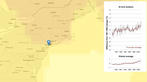
New Scientist has this neat tool that lets you see how average temperatures in specific locations all around the world have changed over the past 120 years or so. Just stick in a city and country, and you can find out how totally screwed you are. For instance, here in Brooklyn, N.Y., we are only moderately screwed.
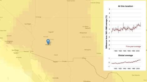
Whereas in Phoenix, it’s not looking so hot. Metaphorically. Technically, it’s looking pretty hot indeed:
You can also go back in time. On the map, that is. In real life, forward is the only way to go, and, based on these trend lines, we’re feeling a little nervous about that.
A message from
Your support keeps our climate news free.
Grist is the only award-winning newsroom focused on exploring equitable solutions to climate change. It’s vital reporting made entirely possible by loyal readers like you.
At Grist, we don’t believe in paywalls. Instead, we rely on our readers to pitch in what they can so that we can continue bringing you our solution-based climate news. Donate today to keep our site free.