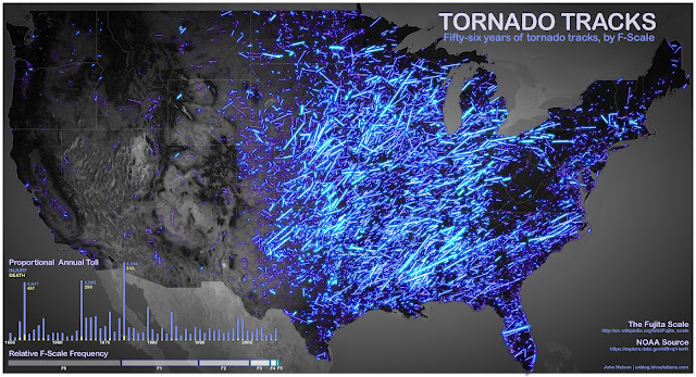
Here’s 56 years’ worth of tornado tracking data, which makes the eastern half of the U.S. look like it’s exploding in a shower of welding sparks or fireworks. Brighter lines represent more violent storms. I’d love to see this data for the last 10 years, as compared to any other decade.


