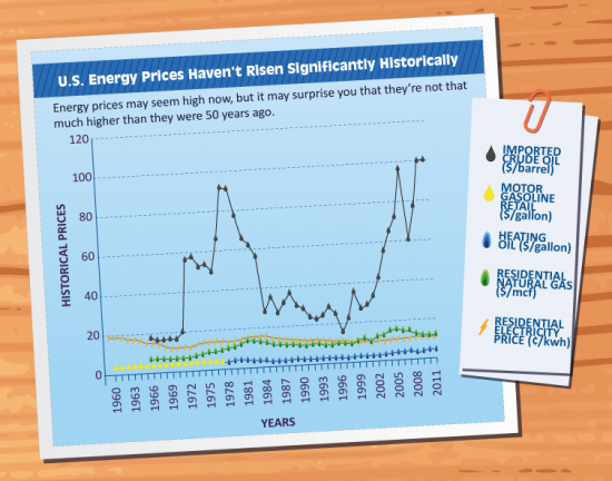
Americans pay about the same as they did in 1960 for most forms of energy, says this infographic produced by the home energy audit folks at WellHome. Except for oil, which is now on average even more crazy-expensive than it was during the oil crisis of the 1970's, when people were ready to bash each others' heads in to be next in line at what few stations still had fuel to sell. That’s not reflected as much in the price of gas as you might expect, in part because the scale of this graph minimizes swings in gasoline prices, and also because there isn’t a one to one relationship between oil and gas prices. (Gas is also influenced by the costs of refining it and getting it to market.)
Regardless, the lesson here is that anything we can do to give consumers an alternative to oil for transportation will help ease the pain they feel in their wallets. And because just about every alternative, from walkability and mass transit to electric cars, has a lower carbon footprint than conventional vehicles, efforts to help the bottom line by moving us away from oil are also a de facto climate policy. It's cliche to call it a win-win, but there you have it: some things are self-evidently a good idea.


