We just completed our first news hackathon afternoon. The purpose of the event was to give everyone at Grist the opportunity to try out new tools and ways of working together. The specific challenge of the day: given 4 hours, tell a relevant story with data. That’s it! No more guidance was given (well OK maybe some was, but since it was justifiably ignored in pursuit of some cool ideas, I won’t detail it here.)
Here’s what happened:
Team Halliburton (Nathan, Wade and Dave) worked up an interactive timeline of last year’s oil spill, featuring cool “sinking rig” graphic and movable map background. The timeline data was sourced from data.gov.

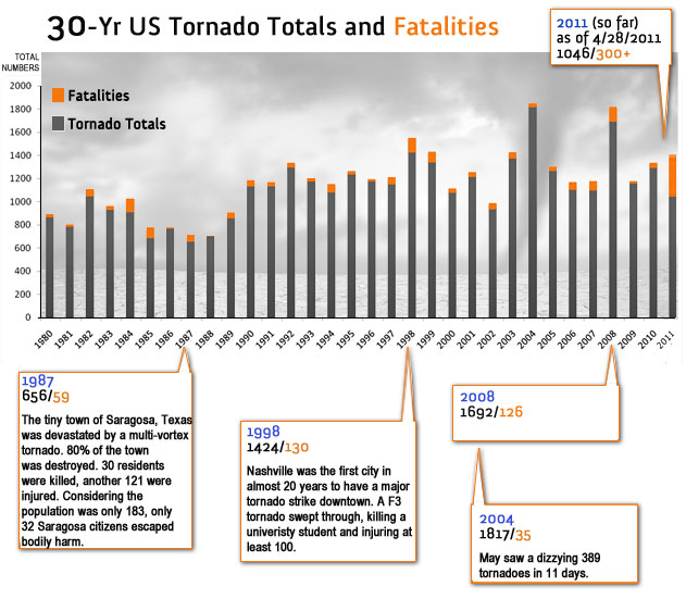
Team Exxon (Libby, Cindy, Darby, Matt) produced a post about last week’s tornado activity based on historical tornado data. They used Excel and plain ‘ol photoshop to produce the following trend chart:

Then, they used openheatmap to make the following animated map/timeline of tornado severity (which it should be said, lacks a certain amount of context but is cool anyway):
http://www.openheatmap.com/embed.html?map=SlenderestUnderskirtsDizzying
Team Monsanto (Darcy, Hanna, Lisa, Dan) explored the relationship between walk score and political affiliation, and discovered that the only (ONLY!) walkable Republican city is ……….. Oklahoma City. They also used wordle to analyze recent Grist content, resulting in this:
This was a pretty successful day from our point of view. At the very least, it has given us some valuable insight into what it takes to do this kind of work, and how it might happen here more often.


