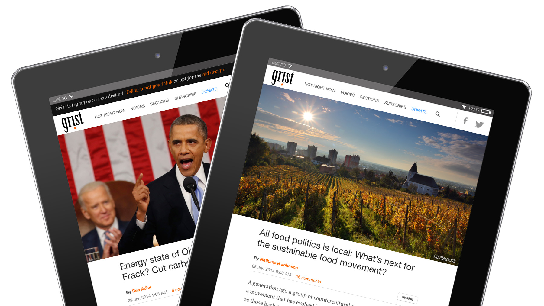
Who doesn’t love a tablet?
The sparkle of the glass! The depth of the screen window! The sleek bezel! The smooth feel! The desperate losing battle to keep greasy fingers from ruining all that perfection!
We know you love your tablets because we see a steady increase in the percentage of Grist articles that are consumed on them. (It’s now about 10 percent.) That’s why I’m very pleased to introduce you to a brand-new Grist-for-tablet design that you’ll now see every time you load our site up on your iPad or Android tablet.
My immensely talented developer and designer colleagues here on our product team have invested all sorts of creative energy in making Grist easier and more fun to read on these platforms.
No more zooming in on text to read stuff. Our simpler home page design means that you can discover more stories with a quick swipe. Behind the scenes, pages should load faster, too.
This new design is built on the foundation of the smartphone design we rolled out last fall. Later this spring we’ll be extending this same approach onto our desktop version — and all of Grist will be unified under one big, bright, beautiful vision. Then, our master plan will be complete: One responsive design to rule them all! The world will TREMBLE …
Sorry, I don’t know what came over me. We’re taking a humble, iterative approach to this project, of course, and it will continue to evolve based on your feedback. So leave a comment below, contact us, or tweet at us @grist! And enjoy.


