Before the 2007 IPCC report was released, this infographic was taken out (click for larger version):
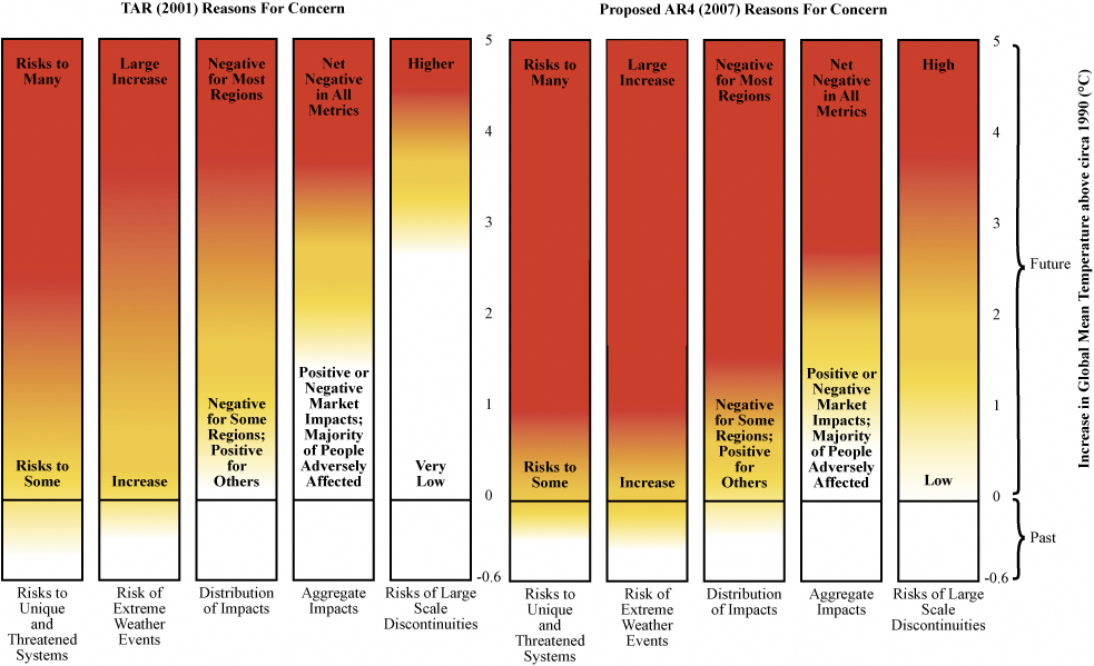 Seems the scientists were uncomfortable with it, deeming it too subjective, or too scary, or something. Basically the red shows the growth of various risks between 2001 and 2007. Surprise: risks have grown!
Andy Revkin has more.
A message from
Your support keeps our climate news free.
Grist is the only award-winning newsroom focused on exploring equitable solutions to climate change. It’s vital reporting made entirely possible by loyal readers like you.
At Grist, we don’t believe in paywalls. Instead, we rely on our readers to pitch in what they can so that we can continue bringing you our solution-based climate news. Donate today to keep our site free.