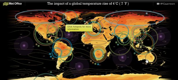
No need to waste your money on the new apocalyptic thrillers coming soon to theaters. A new world map released Thursday by the British government, and unveiled at the Science Museum in London, provides plenty of real life doom and gloom — and it’s free!
The slick and colorful interactive graphic shows what a 4 degree C (7 degree F) rise in global temperature will mean for specific regions of the world. High, er, lowlights include: a high risk of forest fire danger in every populated continent; a decrease in rice yield of up to 30 percent in China, India, Bangladesh, and Indonesia; droughts that occur twice as often in southern Africa, southeast Asia, and the Mediterranean basin; an almost complete disappearance of near-surface permafrost in northern Siberia; more intense and destructive tropical cyclones. Oh, and the hottest days in North America are expected to 18-22 degrees F warmer.
The map also illustrates the potential effects of severe temperature increases on water availability, marine life, and sea level.
Data for the map is based on the latest peer-reviewed research from climate scientists at the Met Office Hadley Centre, the U.K.’s foremost climate change research center, and other leading climate scientists. Their professional consensus, based on a study released last month by Britain’s Met Office, is that unless we dramatically curb CO2 emissions the critical 4 degrees C mark could come as early as 2060.
(Note: To get to the interactive version of the map click on the image below.)
 Photo: Met Office