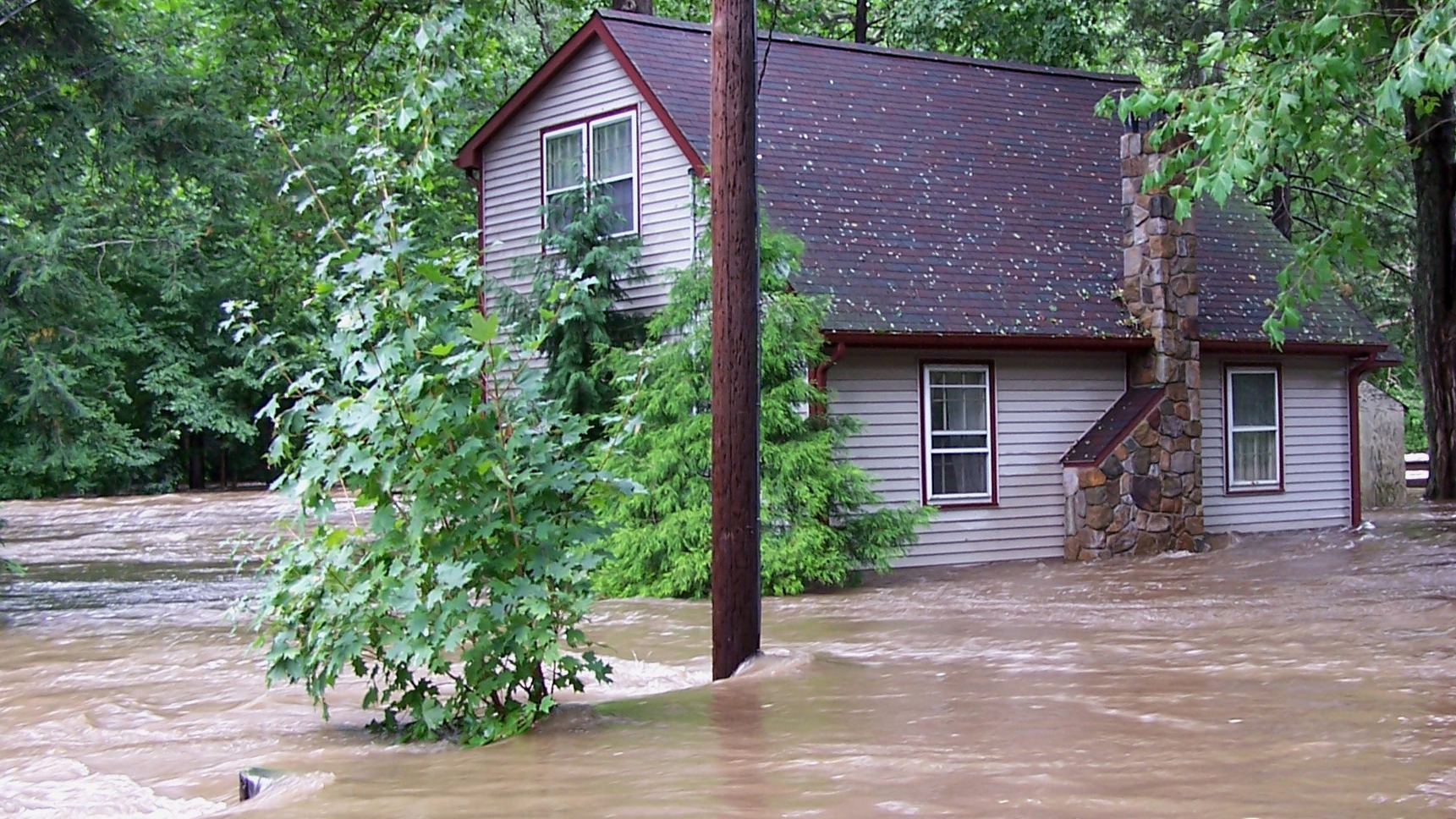
The federal government will begin making its hurricane warning maps more colorful this summer, adding a range of hues to represent the danger of looming floods.
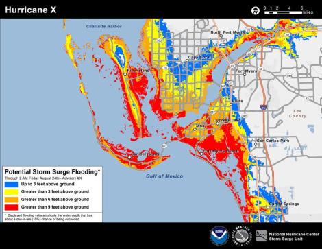
Red, orange, yellow, and blue will mark coastal and near-coastal areas where storm surges are anticipated during a hurricane. The different colors will be used to show the anticipated depth of approaching flash floods.
Severe flooding that followed Superstorm Sandy helped prompt the change — NOAA says it had a hard time convincing Manhattanites that they faced any real danger from such floods.
“We are not a storm-surge-savvy nation,” Jamie Rhome, a storm surge specialist with NOAA’s National Hurricane Center, told Reuters. “Yet storm surge is responsible for over half the deaths in hurricanes. So you can see why we’re motivated to try something new.”
Here’s a hypothetical example of what one such map might look like for Florida. Beware, Ft. Myers!


