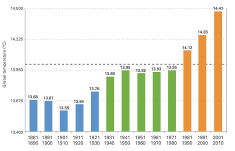
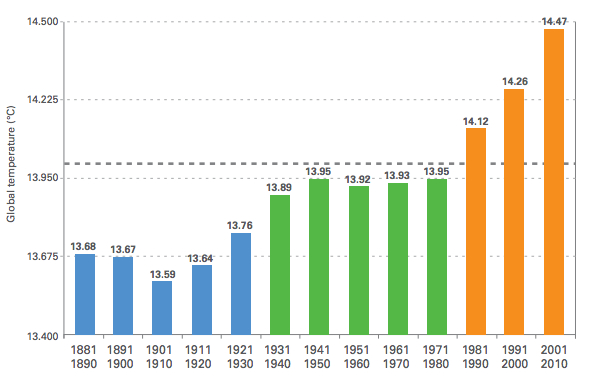
If you look at the last 13 decades, the past three have been the warmest — and increasingly so. But those are just words. Check out this graph unearthed by Ezra Klein on the Washington Post:

World Meteorological AssociationThe gray line is the long-term average for 1961-1990 (57 degrees F).
Pretty hard to argue with that, right? Mostly because that’s a graph and graphs don’t talk. But yeah, the data are pretty compelling too. As Klein points out, 2012 was the ninth-warmest year ever recorded — but that could always be a fluke, since average temperature tends to fluctuate year by year. Once you collect the temperature data into decade-long chunks, though, it’s clear that these record-setting years aren’t outliers but indicators of a stark overall trend.
The graph is from a recent report [PDF] by the World Meteorological Association, which notes:
The period 2000-2010 was the warmest decade on record since modern meteorological records began around 1850.
Blah blah normal fluctuations, you say your coworker Perry says?
The Earth’s climate fluctuates over seasons, decades and centuries in response to both natural and human variables …
The rapid changes that have occurred since the middle of the past century, however, have been caused largely by humanity’s emissions of greenhouse gases into the atmosphere. Other human activities also affect the climate system, including emissions of pollutants and other aerosols, and changes to the land surface, such as urbanization and deforestation.
‘Nuff said.


