Solar energy production in the U.S. jumped by 49 percent last year, and wind energy by more than 16 percent.
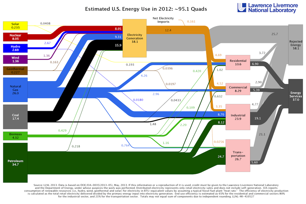
But these clean sources of energy are still just thin lines on this cool flowchart that shows how America’s energy was produced in 2012, reminding us how much work lies ahead in shifting to a renewable and clean economy:

LLNLClick to embiggen.
From Lawrence Livermore National Laboratory, which produced the chart:
[W]ind power [increased from] from 1.17 quads produced in 2011 up to 1.36 quads in 2012. New wind farms continue to come on line with bigger, more efficient turbines that have been developed in response to government-sponsored incentives to invest in renewable energy.
Solar also jumped from 0.158 quads in 2011 to 0.235 quads in 2012. Extraordinary declines in prices of photovoltaic panels, due to global oversupply, drove this shift.
This is the first year in at least a decade where there has been a measurable decrease in nuclear energy.
“It is likely to be a permanent cut as four nuclear reactors recently went offline (two units at San Onofre in California as well as the power stations at Kewaunee in Wisconsin and Crystal River in Florida),” [energy systems analyst A.J.] Simon said. “There are a couple of nuclear plants under construction, but they won’t come on for another few years.”
Coal and oil use dropped in 2012 while natural gas use jumped to 26 quads from 24.9 quads the previous year. There is a direct correlation between a drop in coal electricity generation and the jump in electricity production from natural gas.
The proportion of American energy that comes from fossil fuels may seem daunting and overwhelming, but solar and wind are making gains as prices drop. And if we really want to make a dent in our fossil-fuel addiction, there’s big opportunity in the gray area labeled “rejected energy.” That’s a euphemism for wasted energy, much of which is lost in the form of heat.


