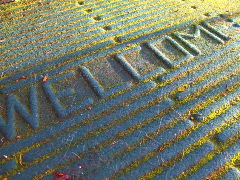
Today we pull the (biodegradable) wrap off our new home page design here at Grist. Come on in! Sit! Coffee? We’re glad you’re here.
This overhaul is intended to be a substantial evolution in our design — not a radical overhaul, but not a baby step, either. That means we’re still lighting up your screen with a little splash of orange (think of it as beta-carotene!). We’re still showing you one section for our features and another of our shorter, bloggier, newsier items. But we’re bringing our front page look into line with the changes we introduced earlier this year on our article pages. Because, you know, ever since then the inconsistency has been bugging us. And we’ve been holding our breath. And that’s just not healthy.
The first big change you’ll notice is that we’ve put the old rotating carousel to rest. (It has earned its retirement, is grateful for the break, and was last seen feeding the slots at Vegas.) We’ll use our lead-story spot to highlight one story that we think is crucial for you to read, or especially urgent, or perhaps splutteringly funny — with, as often as we can, an image that makes you go “wow” or “sheesh” or “mmmm.” Over on the left, you’ll always see the latest posts from our tireless team of Gristmill news bloggers and Grist List curators. Down the page, you’ll find a reverse-chronological listing of all of our recent feature articles and posts.
We’ve also reorganized our navigation bar and rearranged the top-of-the-page area. That row of highlighted stories next to the Grist logo is meant to feature recent posts of the Must. Click. Now. variety. If you’ve already stopped reading this because of them, they’ve done their job.
If you came to this post via our home page at grist.org you probably noticed the difference; if you didn’t, go have a look around! And of course tell us what you think. Because we’re not done. We’re never done. We plan to use this revamp as the starting point for further change — tiny tweaks and big experiments alike. So the feedback you give us — in comments right here; on our contact form; on Facebook or Twitter; we’ll even read your faxes if that thing in the corner still works — really does make a difference.


