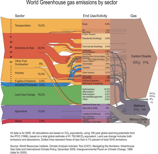

This chart from the United Nations Environment Programme (click to embiggen) looks complicated, sort of like a traffic sign cross-bred with a banyan tree. But it basically just traces the path of greenhouse gases from polluting industries, through uses, out into the atmosphere. So you can tell at a glance, for instance, that energy industries produce by far the most greenhouse gases, or that most of the methane comes from oil processing and livestock.