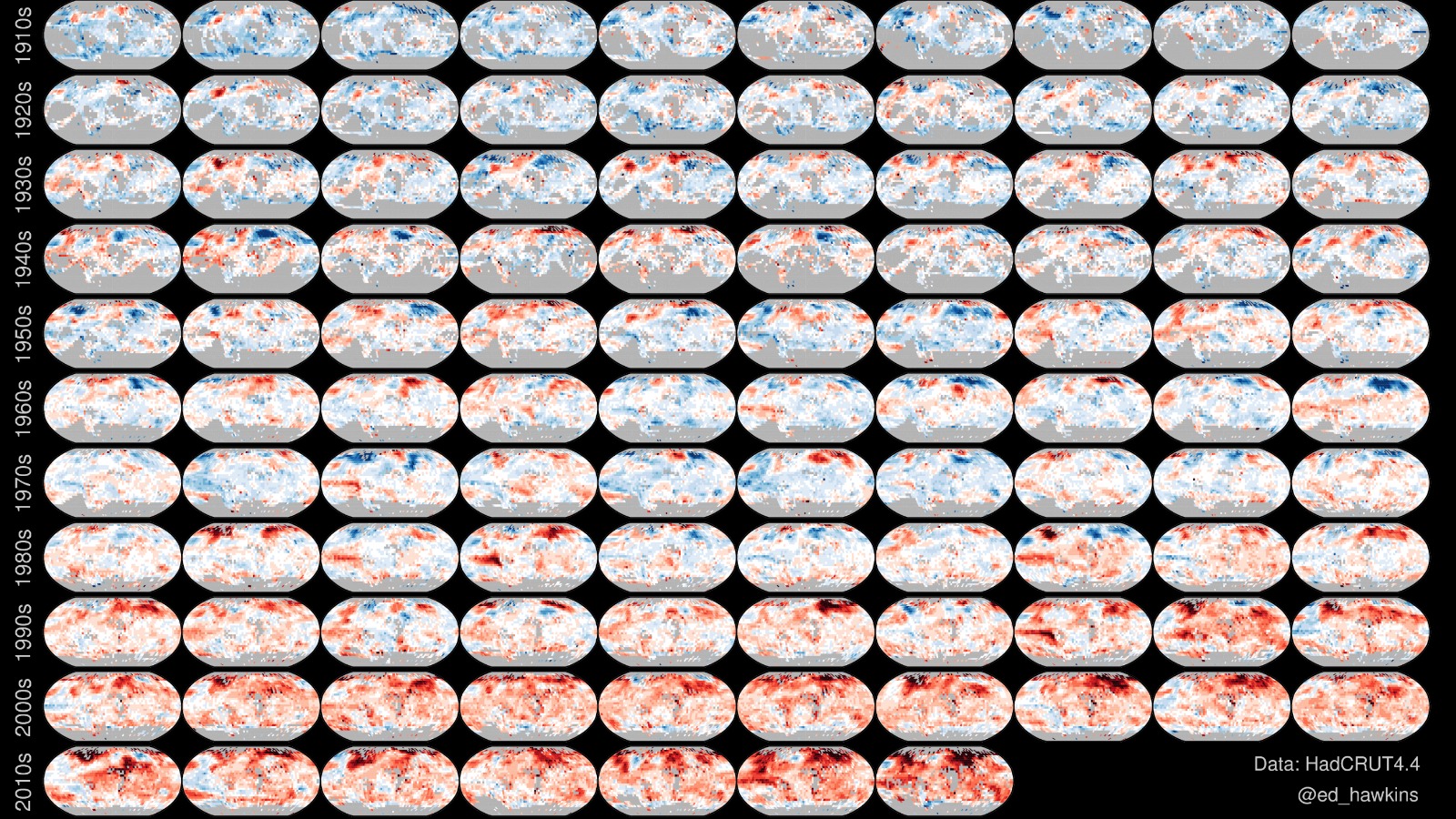
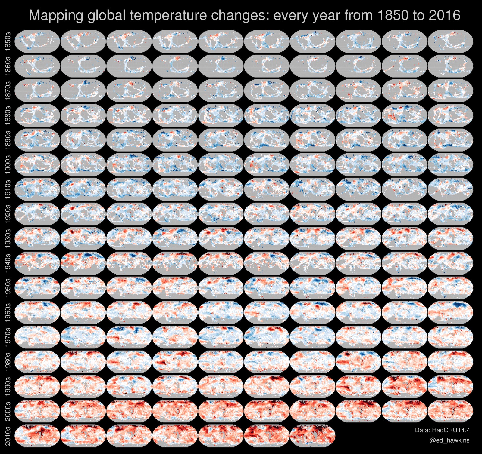
Scientists are getting better at producing visualizations that make climate change, a pretty heady topic, simple enough to take in at a glance. This image charts global temperature changes each year since 1850, using the period from 1961 to 1990 as a baseline. The color scale ranges from dark blue (-2.5 degrees C) to dark red (+2.5 degrees C).
It was created by climate scientist Ed Hawkins, the same person who brought us the popular hypnotic GIF of global temperatures spiraling out of control.