By now, most of us know last month was the busiest April ever for tornadic activity; with May hosting the deadliest single tornado on record, the whole country’s talking about the Fujita Scale, core bursting, and Helen Hunt like it’s 1996. For those who refuse to even talk about the links between twisters and climate change, Bill McKibben drops a dose of hot, buttery sarcasm in a valiant attempt to pull a few heads out of the sand over at the Washington Post.
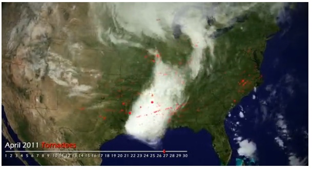
Now NOAA offers up some raw data, cleanly and terrifyingly executed: In the following time-lapse animation, April’s tornado activity appears across the U.S. in spattery patterns of red. April really starts to look like a 300 outtake midway through the video. Check it:
(h/t The Maddow Blog)
A message from
Your support keeps our climate news free.
Grist is the only award-winning newsroom focused on exploring equitable solutions to climate change. It’s vital reporting made entirely possible by loyal readers like you.
At Grist, we don’t believe in paywalls. Instead, we rely on our readers to pitch in what they can so that we can continue bringing you our solution-based climate news. Donate today to keep our site free.