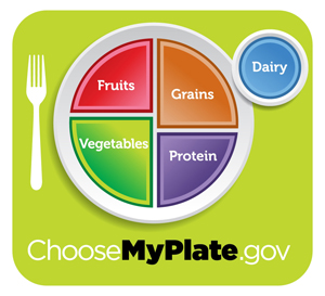

Here's the USDA's new food guidelines, in an appropriate graphical form: the plate chart. (A pie chart would have too much refined sugar.) It lacks the mystical and ancient appeal of the food pyramid, but is perhaps more relevant to your daily food-eating life. (But is it kosher or something? Why is the dairy on a separate dish?) [Update: It's a glass of milk! I JUST got that.]
The take-home messages are:
- Avoid oversized portions.
- Make half your plate fruits and vegetables.
- Make at least half your grains whole grains.
- Switch to fat-free or 1 percent milk.
- Go for lower-sodium options.
- Drink water.
Hard to argue with that. The USDA takes the plate thing a little far, though, demonstrating portion sizes by showing food on generic white dishes, with no size reference except a grid. (As cliche as "the size of a pack of playing cards" was, I can visualize that better than "taking up the pictured amount of real estate when put on a 10-inch dinner plate.")
A message from
Your support keeps our climate news free.
Grist is the only award-winning newsroom focused on exploring equitable solutions to climate change. It’s vital reporting made entirely possible by loyal readers like you.
At Grist, we don’t believe in paywalls. Instead, we rely on our readers to pitch in what they can so that we can continue bringing you our solution-based climate news. Donate today to keep our site free.