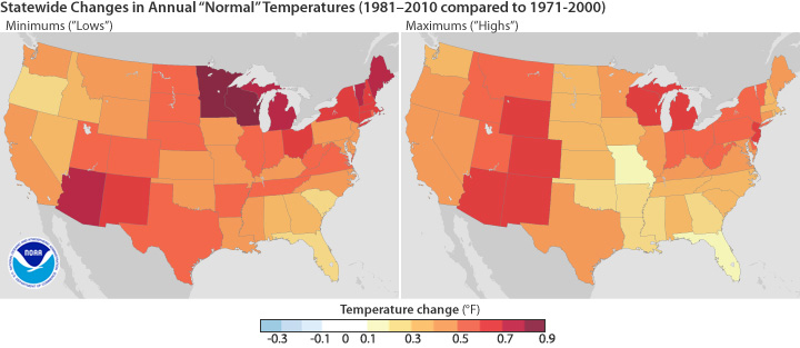
Here's what the new normal looks like. Once a decade, the National Oceanic and Atmospheric Administration updates its definition of "normal" temperatures, based on the average temperatures of the previous 30 years. Here's how the 1981-2010 "normal" compares to the 1971-2000 "normal." Basically, it's a lot hotter. WHY COULD THAT BE??
Since NOAA's last normal-temperature assessment, minimum temps in Minnesota and Wisconsin increased by nearly a full degree, with Maine, Vermont, Michigan, and Arizona not far behind. On average, normal temperatures increased by half a degree.


