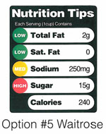
Still smarting over the industry’s shenanigans over the “Smart Choices” label, the FDA has decided to pick up the pace of change. Marion Nestle dug up a set of proposed new front-of-package nutrition labels that the FDA is studying, one of which may ultimately get the agency’s final approval. Here they are:


My faves are the “Nutrition Tips” label with colors and the last one, dubbed “Waitrose,” with the traffic light label. It’s worth noting that FDA Commissioner Margaret Hamburg is already on the record as supporting the traffic light system — it’s currently in use in the UK and studies suggest it’s the most effective form of nutrition info. But both the Nutrition Tips and the traffic light label present meaningful information that goes beyond simply noting the calories. Though if I had to bet, I’d suggest that the industry will push hard against any label that tries to characterize particular nutrient levels as too high. If the Smart Choices debacle taught us anything, it’s that food companies only want to offer encouragement for a purchase and have no interest in a label that might discourage you from picking up a product on first sight. What do you all think? And don’t just tell me! Click here to write an email to the FDA (with the recipient, subject, and required header for your message all filled out for you) telling them what kind of front of package nutrition label you support — they want your feedback!
 At the same time as they’re working on the front of package label, the FDA is also now accepting comments on its initiative to remake the existing side-panel nutrition labels. And the outside suggestions are starting to roll in. A good example comes from the Center for Science in the Public Interest, shown at right. In some ways, it’s got a bit of a behavioral economics, “Nudge“-y style to it — small changes that alter the way you look at the label and possibly the way you think about the product.
I like how the red text used for nutrients that exceed the recommended daily amount as well as the increased font size for calories draw the eye. Breaking out the amount of added sugars into its own category also represents a helpful improvement. Also, note the idea of classing all the sugars together in the ingredients list, which specifically defeats food companies’ technique of using a half dozen forms of sugar to hide the fact that it’s often the number one ingredient by weight.
But admiring CSPI’s work isn’t the end of it. The FDA wants to hear from you about this label as well. Go here and tell them what you think. If you want a helpful cheat sheet, check out Fooducate’s 7 suggestions for labeling improvements. Get to it, people!


