This piece of coal is sad and feeling unloved. Good.
Literally while we were posting our article about Europe’s adoration for burning up coal, this came across the wire (Twitter) from ThinkProgress:
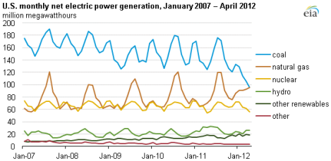
For the first time in U.S. history, natural gas electricity generation equaled coal generation, according to preliminary April figures from the Energy Information Administration:
… As the agency points out, there are a variety of factors that contribute to the changes in generation such as seasonal variability, changes in prices, age of infrastructure, and rising or falling inventories. But looking at the chart above, we can see a clear longer-term trend: use of coal is declining steadily and natural gas is filling in the gap.
In fact, recent data from the EIA showed that generation from coal dropped 19 percent between the first quarter of 2011 and first quarter of 2012 — moving from 44.6 percent to 36 percent. If this preliminary data is correct, that means that coal generation fell another 4 percent between March and April of this year.
This is remarkable enough that I added emphasis above. Coal is declining! Banner headline, front page above the fold, 40-point type. Definitely read the rest of the ThinkProgress piece for more context, first taking a second to applaud.
But here’s something else I noticed.
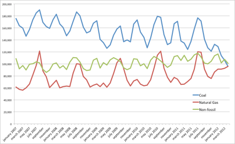
I took the full dataset from the EIA and put it into Excel, curious about how the trend between fossil fuels and non-fossil fuels looked. (Yes, I’m including nuclear in non-fossil fuels because it is not a fossil fuel. No, this does not mean that I heart nuclear. Yes, I am happy to be yelled at in the comments.)
Over the last two months, for the first time ever, non-fossil fuel generation topped coal and natural gas.
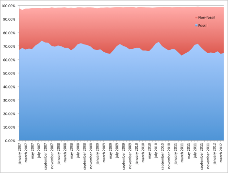
Now, that’s interesting, to be sure. But it’s not a development that’s likely to stick, as natural gas’ continued growth will soon put fossils back into first place. After all, here’s how the percentage of total generation compares between fossil (coal and natural gas) and non-fossil sources.
In general, the latter has grown from about 30 to 33 percent of all generation, with seasonal spikes and valleys. That hasn’t changed dramatically over the last five years — nor is it likely to over the short run.
The most interesting — and important — graph would be one that doesn’t yet exist: what this shift in energy production means for carbon output and for public health. The demise of coal is a good thing. The crushingly slow shift toward renewables is not.


