(Part of the How to Talk to a Global Warming Skeptic guide)
Objection: Global temperatures have been trending down since 1998. Global warming is over.
Answer: At the time, 1998 was a record high year in both the CRU and the NASA GISS analyses. In fact, it blew away the previous record by .2 degrees C. (That previous record went all the way back to 1997, by the way!)
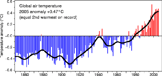
According to NASA, it was elevated far above the trend line because 1998 was the year of the strongest El Nino of the century. Choosing that year as a starting point is a classic cherry pick and demonstrates why it is necessary to remove chaotic year-to year-variability (aka: weather) by smoothing out the data. Looking at CRU’s graph below, you can see the result of that smoothing in black.

Clearly 1998 is an anomaly and the trend has not reversed. (Even the apparent leveling at the end is not the real smoothing. The smoothed trend in 2005 depends on all of its surrounding years, including a few years still in the future.) By the way, choosing the CRU analysis is also a cherry pick — NASA has 2005 breaking the 1998 record, though by very little.
Now, this is an excusable mistake for average folks who do not need the rigors of statistical analysis in their day jobs. But any scientist in pretty much any field knows that you cannot extract meaningful information about trends in noisy data from single-year end points. It’s hard to hear a scientist make this argument and still believe they speak with integrity in this debate — seems more like an abuse of the trust placed in them as scientists. Bob Carter is just such a voice, and was the first to trot out this argument in an article in the Daily Telegraph. Since then it has echoed far and wide and been used by Richard Lindzen as well as a host of skeptic websites.
Interestingly, Bob Carter seems to know what he is doing. He tries to pre-empt objections in his article by insinuating that any choice of starting point (say, 1978) will just be a cherry pick with the opposite motive! But cherry picking is about choosing data for the sole purpose of supporting a pre-conceived conclusion. It is not the simple act of choosing at all. One must choose some starting point. In the case of his example year, 1978, it’s often chosen simply because it is the first year that satellite records of tropospheric temperatures were available.
So what choices are there? What are the reasons for those choices? What conclusions we can draw from them?
- As mentioned above, you could choose to examine the last 30 years — that is when both surface and tropospheric readings have been available. We have experienced warming of approximately .2 degrees C/decade during this time. It would take a couple of decades trending down before we could say the recent warming ended in 1998.
- You could choose 1970 in the NASA GISS analysis — the start of the late 20th century warming, and as such a significant feature of the temperature record. The surface temperature over this period shows .6 degrees C warming.
- You could choose 1965 in the CRU analysis — when the recent warming started in their record. It shows around .5 degrees C warming of the smoothed trend line.
- You could choose 1880 in the NASA record — it shows .8 degrees C warming.
- You could choose 1855 in the CRU record — it shows .8 degrees C warming. As with the trend above, we can not say it is over without many decades more data indicating cooling.
- You could choose to look at the last 500 years in the bore hole record analysis — that is its entire length. It puts today about 1 degree C above the first three centuries of that record. In that kind of analysis, today’s record will be hidden from view for many decades.
- You could choose to look at the last 1,000 years, because that is as far back as the dendrochronology studies reliably go. Then the conclusion is:
Although each of the temperature reconstructions are different (due to differing calibration methods and data used), they all show some similar patterns of temperature change over the last several centuries. Most striking is the fact that each record reveals that the 20th century is the warmest of the entire record, and that warming was most dramatic after 1920.
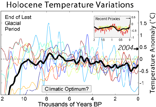
- You could choose to look at the entire period of time since the end of the last ice age, around 10,000 years ago. Then the conclusion is that GHG warming has reversed a long and stable period of slight downward trend, and we are now at a global temperature not experienced in the history of human civilization — the entire Holocene. It will be many centuries until such a long view of today’s climate is available. The situation is a bit more urgent than that!

That about covers any period of time relevant to today’s society. “It has stopped warming” is only supported by selecting a single year out of context and using a seven-year window to look at multi-decadal trends in climate. That’s a classic cherry pick.


