Good news! Research published this week in the journal Nature finds that the seas did not rise as much during the last century as scientists previously thought. Here’s Justin Gillis with the New York Times:
Instead of rising about six inches over the course of the 20th century, as previous research suggested, the sea actually rose by approximately five inches, the team from Harvard and Rutgers Universities found. The difference turns out to be an immense amount of water: on the order of two quadrillion gallons, or enough to fill three billion Olympic-size swimming pools.
Bad news! That means that now they’re probably rising even more quickly than we thought. Gillis again:
That silver cloud comes with a dark lining. The new research confirms numerous previous estimates that the rate of sea-level rise jumped substantially toward the end of the 20th century. The ocean now appears to be rising at a rate of about a foot per century.
And it gets even worse! The study supports previous research suggesting that the rate of sea-level rise is still accelerating. The most recent report from the Intergovernmental Panel on Climate Change predicts that, if we continue polluting the way we’ve been, the seas will rise between 1.7 and 3.2 feet by 2100. But that’s a conservative estimate. A survey of sea-level scientists last year found that most experts believe the IPCC’s worst-case scenario is actually the best we can expect if we aggressively cut greenhouse gas emissions, starting now. Failing that, they said, we can expect 2.3 to 4 feet of rise by 2100, and a whopping 6.5 to 9.8 feet by 2300.
If that doesn’t just ruin your day … well, if it doesn’t, you obviously don’t live in Miami. Or New York City. Or Wallops Island, Va. These burgs already feel the wrath of the rising oceans — because while measurements in feet-per-century may not send chills down your spine, things get scary in a hurry when you add on the feet-per-hour that a big storm surge can bring.
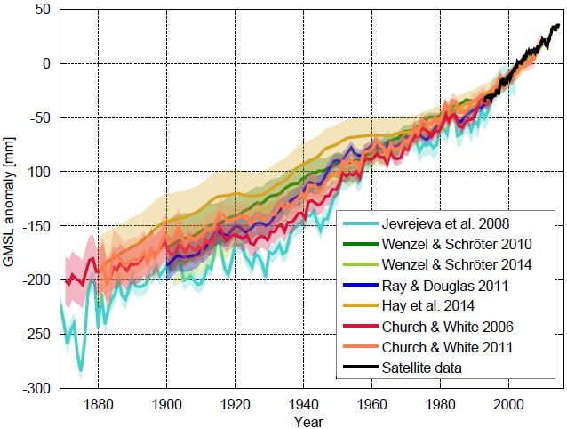
Which is just to say that when the graph charting the seas’ rise over the past 100 or so years starts to look less like a ramp, and more like, well, like a hockey stick, perhaps it’s time to stop dithering around with sad notions about the alleged non-reality of climate change and start getting serious about fighting it. Oh, and think about moving your bedroom to the second floor while you’re at it.
I’ll leave you with this graph, from Stefan Rahmstorf, one of the world’s top sea-level rise researchers, who has a great piece on the subject over at RealClimate.

Sea level curves calculated by different research groups with various methods. The curves show the sea level relative to the satellite era (since 1992).Klaus Bittermann


