Just reading about the government’s massive new report outlining what climate change has in store for the U.S. is sobering. In brief: temperature spikes, drought, flooding, less snow, less permafrost. But if you really want to freak out, you should check out the graphs, charts, and maps.
For the more visually oriented bunker builders out there, here are the 32 most alarming images from the 1,200-page draft report. (Click any of them to embiggen.)
Things will be different.
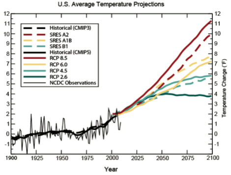
Analysis suggests that temperatures could rise as much as 11 degrees by the end of the century. On this chart, note the lines labelled SRES A2 and SRES B1. Those are the two greenhouse gas emission scenarios used as worst- and best-case scenarios in many of the charts that follow.
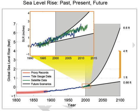
It’s possible that sea levels could only rise eight inches. It is also possible that they could rise over six-and-a-half feet.
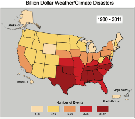
Over the past 30 years, we’ve already seen hundreds of billion-dollar weather disasters — heavily centered on the South and Southeast.
We will be hot.
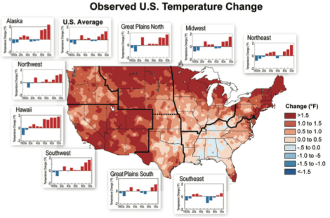
Over the past century, temperature changes have varied by region.
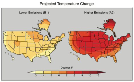
Depending on the emissions scenario, we could see an average of four degrees of temperature increase — or 10 degrees across the country.
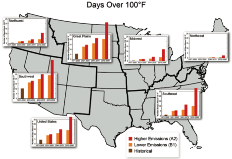
Under the worse-case emissions scenario, annual days over 100 degrees will spike in the Plains, Southwest, and Southeast.
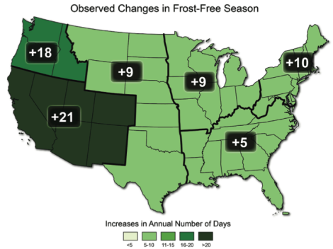
The whole country will see more frost-free days — but particularly in the Southwest.
We will be wet.
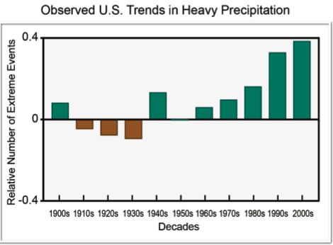
Precipitation has been increasing across the country …
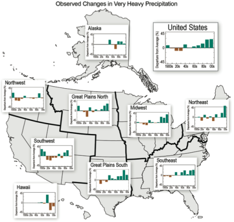
… but that increase isn’t uniform.
We will also be dry.
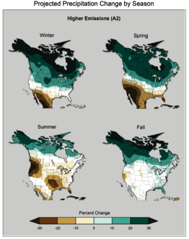
Under a higher-emissions scenario, the southwest will see far less rain.
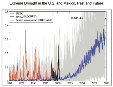
Drought will increase significantly …
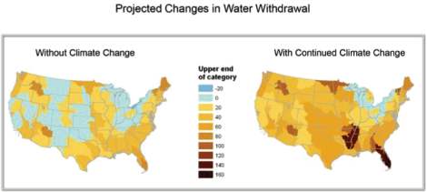
… and we’ll see significant increases in water withdrawal.
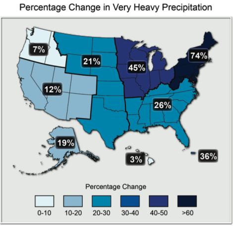
Very heavy precipitation — far bigger storms — will increase dramatically in the Northeast.
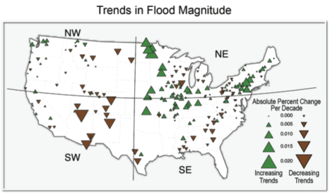
Flooding in the northern Plains and Northeast will increase.
We will be itchy and sneezy and diseased.
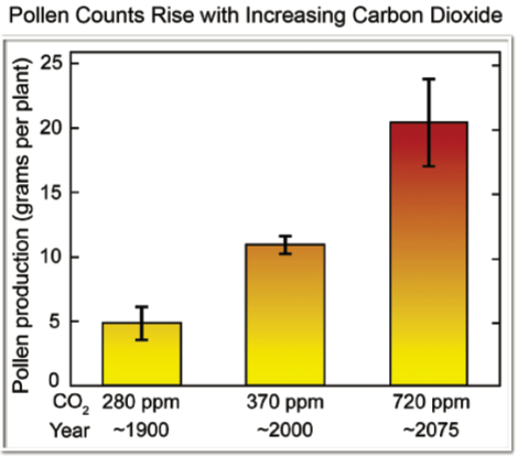
Carbon dioxide increases will lead to more pollen, exacerbating allergies.
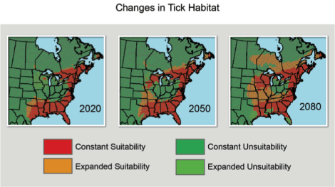
The natural range of ticks will expand.
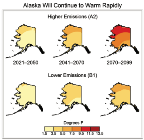
Alaska will become a totally different state.
Under the higher emissions scenario, Alaska could see temperature increases of nearly 12 degrees.
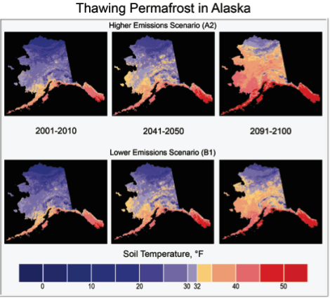
That increased warmth will mean faster thawing of the permafrost, which is very, very bad news.
We will need boats, if we live on the coast.
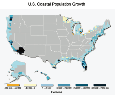
The U.S. has seen huge population growth on its coasts, which is bad news.
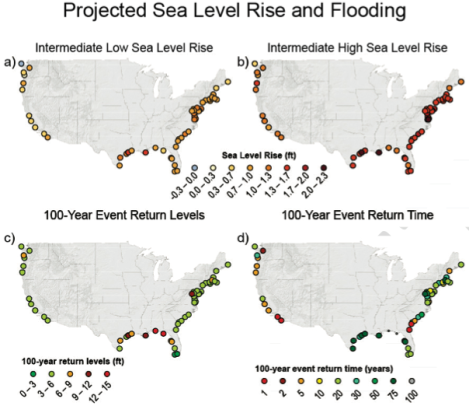
Sea-level rise will affect different areas to different degrees — but note the map at lower right. On the Georgia coast, “hundred year” floods could happen annually.
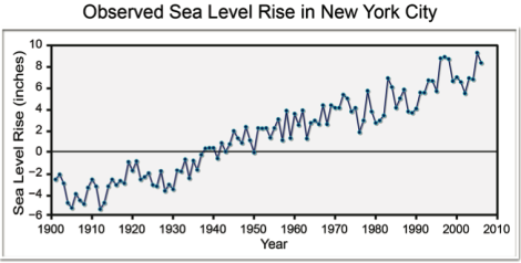
In New York, which has seen sea rise quickly …
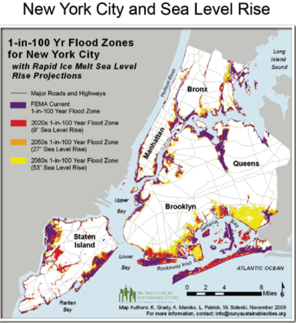
… the boundaries suggesting where a hundred year flood would stop will keep moving inland.
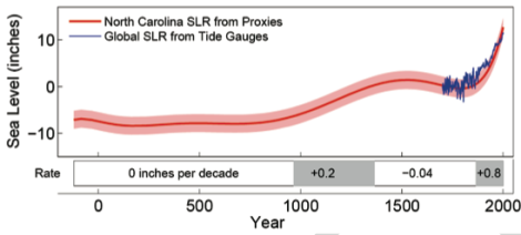
North Carolina will see rising whatever-they-call-its, too.
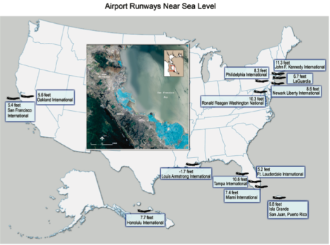
Across the country, airports built near the ocean, often on fill, will become more subject to flooding.
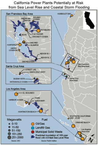
Power plants in California will be threatened by flooding.
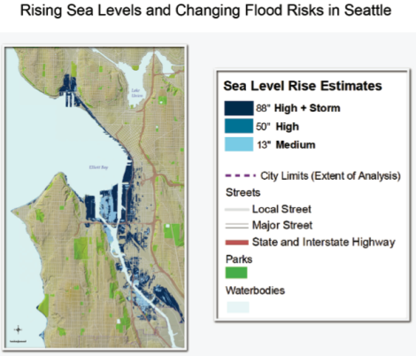
Seattle will see huge areas of the city made vulnerable to flooding and surge. (You can read the details here.)
Or, in summary:
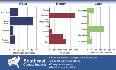
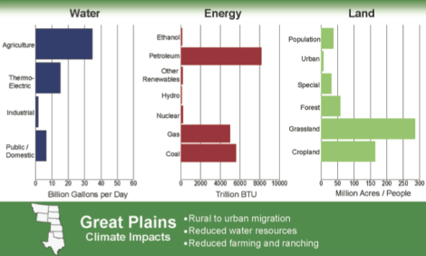
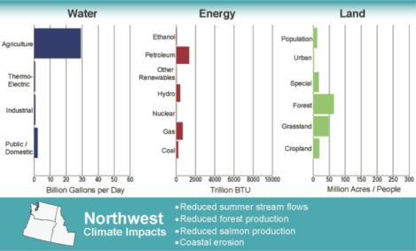
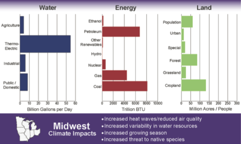
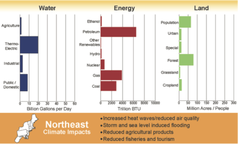
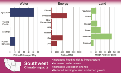
Here’s what you can expect depending on where in the country you live.
If you really want to sleep poorly tonight, open the full report and search for your state. If the temperature is only expected to go up five degrees, consider yourself lucky.

