There was a time in the distant past — call it the late 2000s — when infographics seemed like a good idea. You can pack all kinds of info into a visually appealing file that’s easy to share! What could go wrong?
What could go wrong is that infographics became the No. 1 answer of every middle-aged person in a meeting discussing how to get their organization exposure and create something “viral.” Consequently, the internet is chockablock with terrible infographics — cluttered, over-long flusterclucks that would be better, in every conceivable way, if they were “words” gathered into “paragraphs” to provide “explanations.”
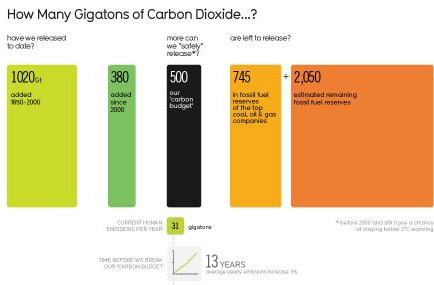
Anyway, infographics are a scourge. Nonetheless, every so often I come across one that’s genuinely informative and helpful. For example, take this one, from the info-ninjas at Information Is Beautiful:
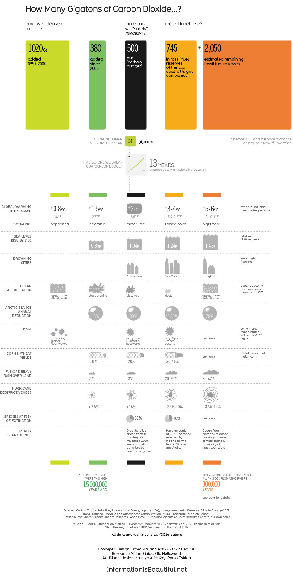
Gorgeous! A compact way of saying what I’ve said with many more words. Share it.
A message from
Your support keeps our climate news free.
Grist is the only award-winning newsroom focused on exploring equitable solutions to climate change. It’s vital reporting made entirely possible by loyal readers like you.
At Grist, we don’t believe in paywalls. Instead, we rely on our readers to pitch in what they can so that we can continue bringing you our solution-based climate news. Donate today to keep our site free.