This story is reproduced here as part of the Climate Desk collaboration.
According to NASA, all of the following statements are true:
- 2014 was the warmest year on record, dating all the way back to 1880.
- 2014 is far more likely than any other year since 1880 to have been the warmest.
- There’s a 62 percent chance that 2014 was NOT actually the warmest year since 1880.
Wait. What??
OK, let’s rewind a bit. It’s a scientific fact that humans are warming the planet by releasing greenhouse gases. This has already resulted in “considerable costs,” explains Kevin Trenberth of the National Center for Atmospheric Research — ice is melting, sea levels are rising, and heatwaves and fires are getting worse. Global warming is a very clear trend stretching back a century, and temperatures in any given year aren’t really that important.
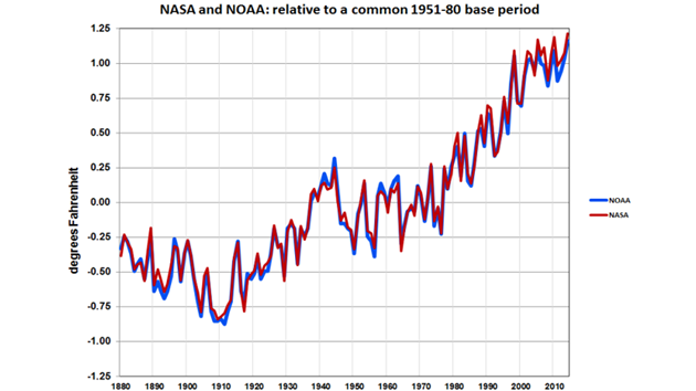
Still, it was big news last month when NASA and the National Oceanographic and Atmospheric Administration jointly announced that, in separate analyses, they had both concluded that 2014 was the warmest year on record. “When averaged over the globe, 2014 was the warmest year on record,” explained NASA earth sciences director Michael Freilich during a Jan. 16 conference call announcing the new findings. As you can see in the chart below, both agencies calculated that 2014 was just slightly warmer than other extremely hot years — specifically, 2010 and 2005.
Of course, calculating the warmth of the entire Earth over a full year is difficult. To do this, climate scientists analyze air and water temperature data collected from thousands of weather stations, buoys, and ships around the world. As explained in this helpful Wired article, this involves complex algorithms that correct for various inconsistencies and potential sources of error.
By far the most important source of uncertainty — at least when trying to calculate the warmest year — is the uneven distribution of temperature measurements around the world. According to NOAA climate scientist Deke Arndt, the agency has adequate temperature data for roughly 88 percent of the planet’s surface. The biggest gaps are in the Southern Ocean that surrounds Antarctica, as well as in parts of Africa and the Arctic. (NASA uses a different methodology that includes data covering a greater portion of the globe.)
In other words, the figures reported by NASA and NOAA represent their best estimates of what the temperature readings they do have mean for the Earth’s climate as a whole. When it comes to detecting the broader warming trend, those estimates are extremely reliable. But ranking individual years is more complicated. “According to our tools, 2014 had the warmest temperature … that’s indisputable,” explains Arndt. The uncertainty, he says, comes from assessing how well those tools measure what’s actually happening, as well as from “what may have happened in the areas we didn’t measure.”
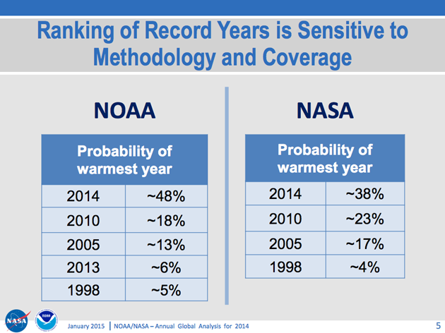
When they released their findings, NASA and NOAA attempted to quantify this uncertainty. As NOAA scientist Tom Karl explained to reporters at the time, this table shows the probability that 2014 (as opposed to other extremely warm years like 2010 and 2005) was really the warmest year:
So both agencies found that 2014 was far more likely than any other year to be the warmest. NOAA put the probability at 48 percent — that’s more than two-and-a-half times higher than the next likeliest year. NASA put the probability that 2014 was the warmest year at 38 percent — lower than NOAA but still much higher than any other year.
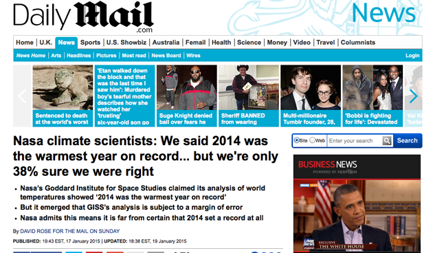
Unsurprisingly, critics pounced on the 38 percent figure. “NASA climate scientists: We said 2014 was the warmest year on record … but we’re only 38 percent sure we were right,” blared London’s Mail on Sunday, a frequent source of climate change skepticism. The Mail story blasted NASA for having issued a press release that didn’t include the uncertainty.
But as Chris Mooney pointed out at the Washington Post, the scientists made the uncertainty figures available when they announced their findings. So criticizing them for supposedly concealing this information doesn’t make any sense. The New York Times and Mashable also have good stories on the controversy, and they extensively quote the NASA and NOAA scientists pushing back on the criticism.
But what does the 38 percent figure actually mean? Wouldn’t it be accurate, I asked NASA scientist Gavin Schmidt, to say that there’s a 62 percent chance that 2014 wasn’t the warmest year? Here’s part of his emailed response:
Your formulation is technically accurate, but begs the question of which year was in fact the record. By the same reasoning, the previous record that no one appears to be disputing (2010) is 77 percent likely not to be. I think that is even more confusing.
We provided these numbers to provide better context beyond simply saying that 2014 was a new record in our analysis (which would have been reported unequivocally in any case). I stand by that.
When I asked Schmidt whether, given the uncertainty, it’s accurate to say 2014 was the “warmest on record,” he responded: “It *is* the warmest year in the record. It is *most likely* to be the warmest in the real world.”
Screenshot of the Mail on Sunday story criticizing NASA
Other climate scientists have interpreted this uncertainty to mean that 2014 is actually in a statistical dead heat with other warm years. The Berkeley Earth group published an analysis arguing that 2014 temperatures were “nominally” the warmest on record, but that “within the margin of error, it is tied with 2005 and 2010 and so we can’t be certain it set a new record.” And former NASA scientist James Hansen published a paper stating:
Update of the [NASA] global temperature analysis … finds 2014 to be the warmest year in the instrumental record … The three warmest years in the [NASA] analysis, 2014, 2010, and 2005 in that order, can be considered to be in a statistical tie because of several sources of uncertainty, the largest source being incomplete spatial coverage of the data.
Schmidt disagrees, arguing that it doesn’t make sense to describe the temperature record as a tie. (Schmidt is actually listed as a coauthor on Hansen’s paper but says he doesn’t agree with the “tie” language). Again, from Schmidt’s email:
[T]his is like a horse race. One year must be … at the top, and 2014 is the favorite. In the NASA analysis, the odds are ~1.6 to 1 for 2014, 3.3 to 1 for 2010, 5 to 1 for 2005 etc. Therefore while 2014 is most likely to be the hottest year, it is not a certainty that it is.
The alternative formulation some people have suggested is simply to say that they were tied[.] But I don’t think that is correct since it would imply equal chances for each year to break the record and the calculations suggest that is incorrect.
The issue got even more complicated in recent days, as several international climate agencies have weighed in. Last week, the British Met Office and the University of East Anglia’s Climatic Research Unit released their own findings, concluding that 2014 was “tied with 2010” as the warmest year on record but that “uncertainty ranges mean it’s not possible to definitively say which of several recent years was the warmest.” And on Monday, the World Metrological Organization announced that it had ranked 2014 as the “hottest year on record” and noted that “the difference in temperature between the warmest years is only a few hundredths of a degree — less than the margin of uncertainty.”
For many scientists, though, the debate over which recent year was really the hottest misses the point. “We’re making the relative ranking of one year over another more important than it should be,” said NOAA’s Arndt, who admitted that he’s “part of this problem.” (I am, too.) In a press release, WMO Secretary-General Michel Jarraud added that “the overall warming trend is more important than the ranking of an individual year.”
Perhaps President Barack Obama summed it up best after mentioning 2014’s record heat during his recent State of the Union address. “One year doesn’t make a trend,” he said. “But this does: 14 of the 15 warmest years on record have all fallen in the first 15 years of this century.”
In other words, watch the man, not the dog:
