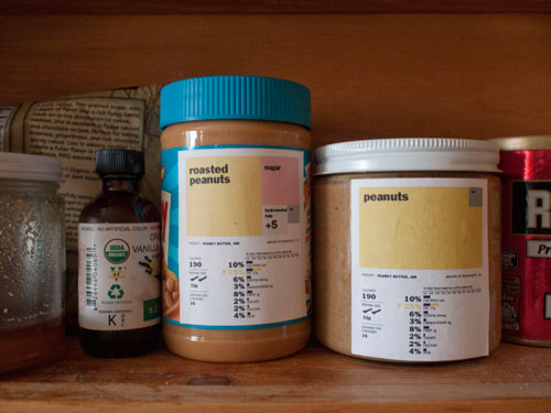
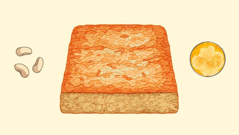
Designer Renee Walker's food labels, which just won the Rethink the Food Label contest, are elegantly simple. They're dominated by a color-coded box that shows the breakdown of ingredients, including unappetizing shades of gray for additives and preservatives. So in one glance you can tell, say, which of these peanut butters has added filler and which one is mostly ground-up nuts.
Unlike most of the proposed labels, Walker's design doesn't moralize with a big red X on foods the designer thinks are bad, or a picture of what the designer guesses you'll look like if you eat them. You want to eat the peanut butter with more sugar? Whatever. But a box of cereal with a big wheat-colored label looks more appealing than one covered in the dreary HFCS, preservative, additive, and trans fat shades — which may mean that people will gravitate towards food with better nutrition. The label essentially uses marketing principles to improve what people eat. FDA, I hope you're taking notes.


