
Click to embiggen.
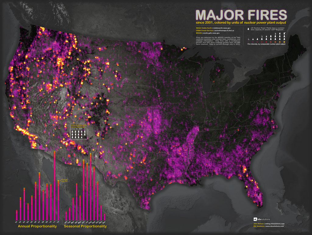
This map by John Nelson shows all major U.S. wildfires (and probably some prescribed fires) since 2001, with yellow being more intense. That bright purple over most of the country except the lucky Northeast is fires that put out maybe half as much energy as a power plant produces in the course of a year. Those bright yellow spots? Those fires are the equivalent of three power plants. The yearly output of three power plants. In one fire.
So I guess if we could harness the power of fires, we’d be able to power the country? That’s the point here, right?
If you liked (= were kinda terrified by) that, you’ll love (= be very terrified by) this animated GIF:

BRB moving to Vermont.
A message from
Your support keeps our climate news free.
Grist is the only award-winning newsroom focused on exploring equitable solutions to climate change. It’s vital reporting made entirely possible by loyal readers like you.
At Grist, we don’t believe in paywalls. Instead, we rely on our readers to pitch in what they can so that we can continue bringing you our solution-based climate news. Donate today to keep our site free.